Gift Cards + Merchandise — 1 platform, 2 product lines
B2C Reward Platform — Gift Cards & Merchandise across Mobile, Web & Brand System
Role:
UI/UX Designer
Researcher
Scope:
Design System, Mobile (40+ screens), Web, Emails, Gift Cards, Certificates
Platforms:
iOS Mobile, Desktop Web (1440px),
Email, Print
Complexity:
Multi-brand co-branding system, Dark Mode, Arabic RTL
Tools:
Figma, FigmaJam, Adobe illustrator,
Adobe Photoshop ,Zoom, Slack
Status:
Shipped to production
Duration 11 Months
01 — The Products
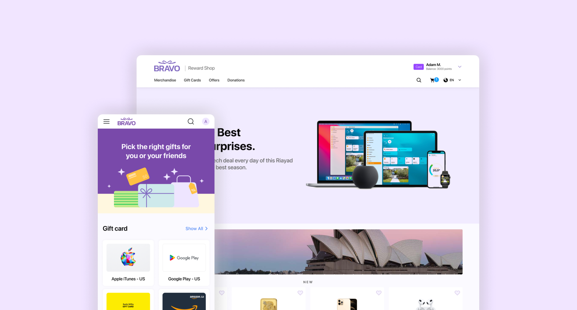
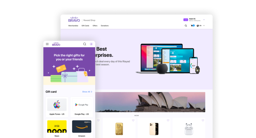
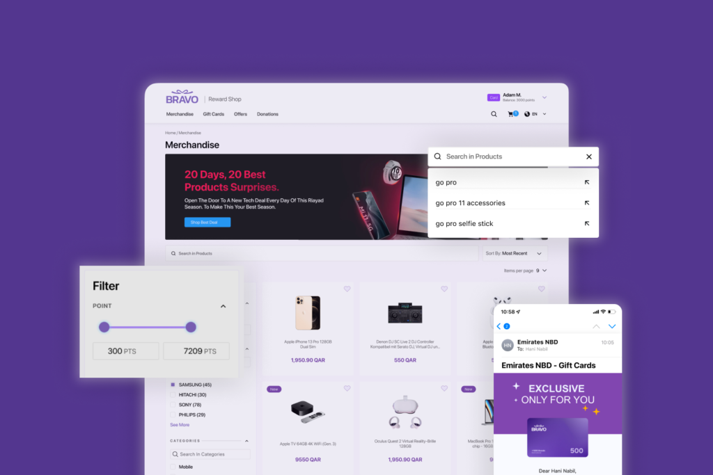
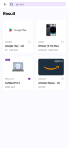
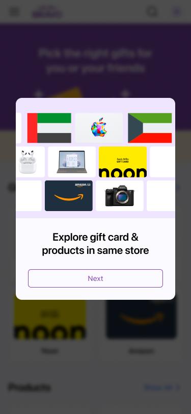
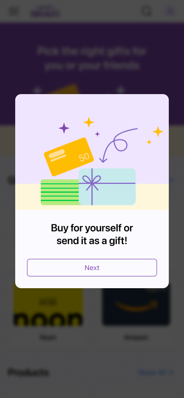
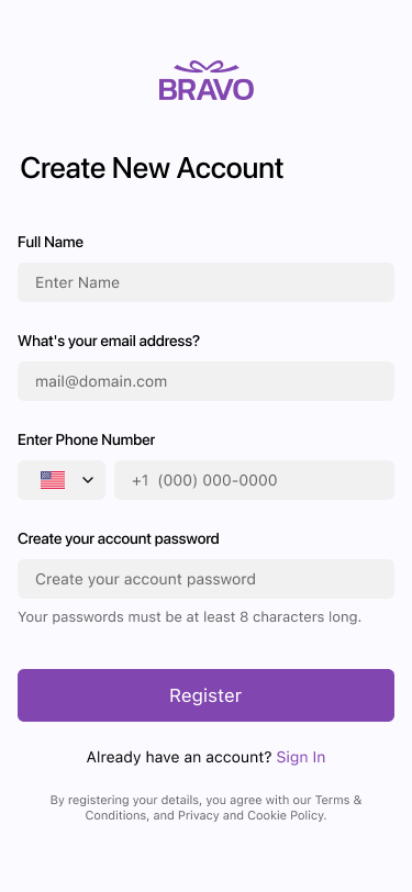
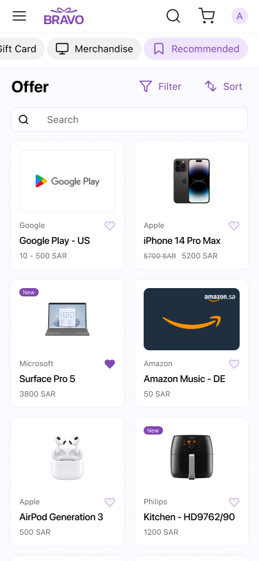
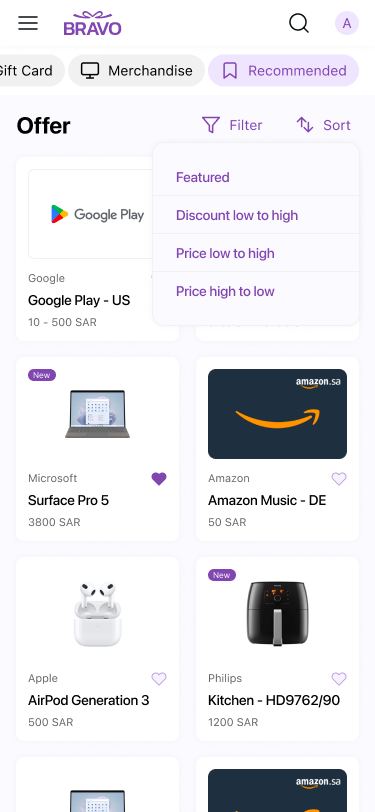
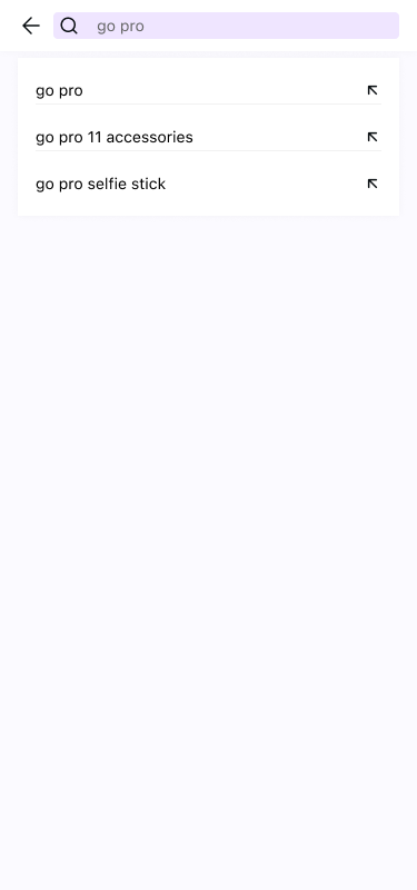
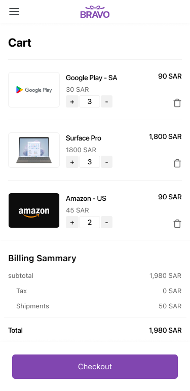
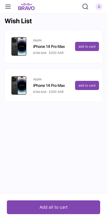
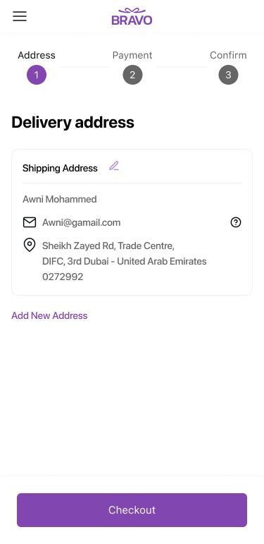
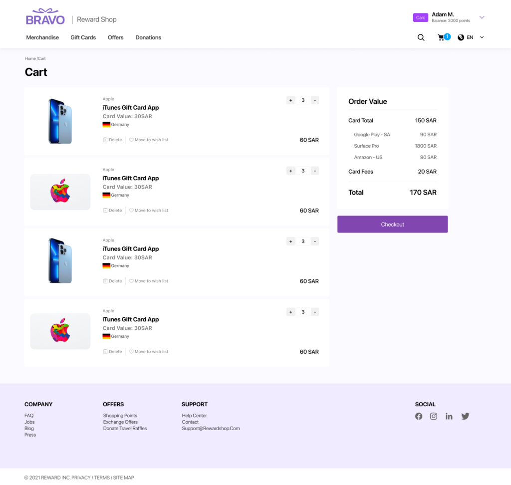
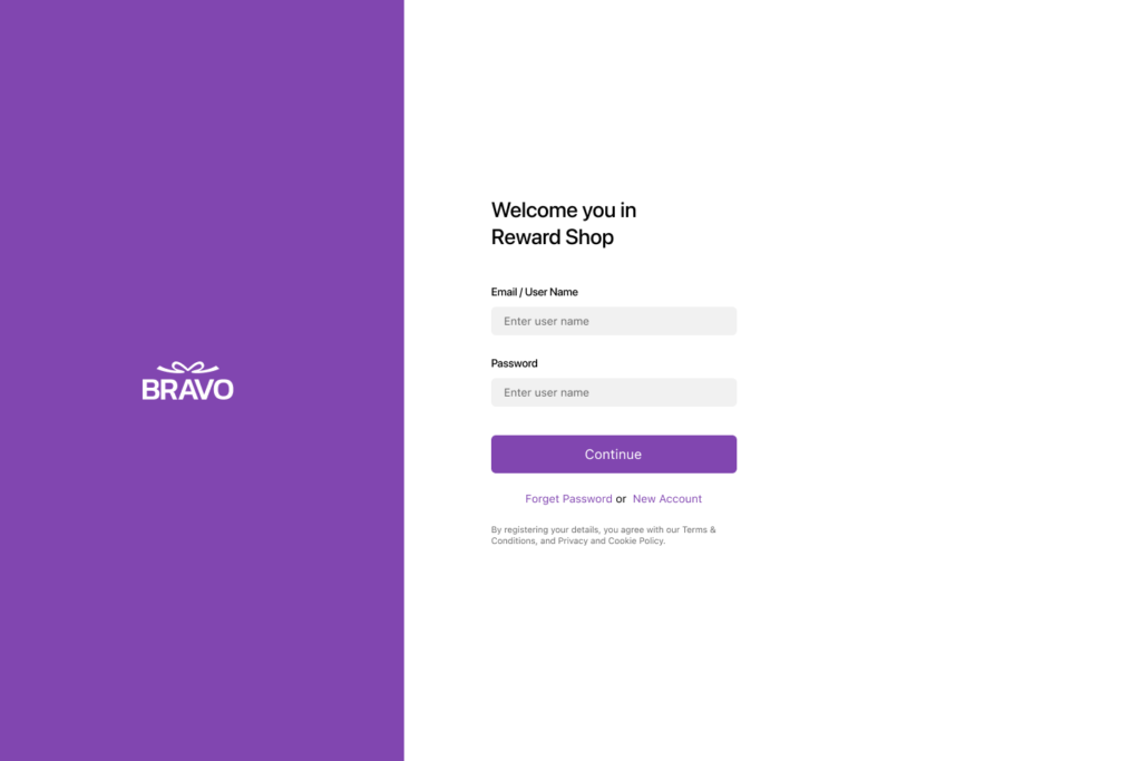
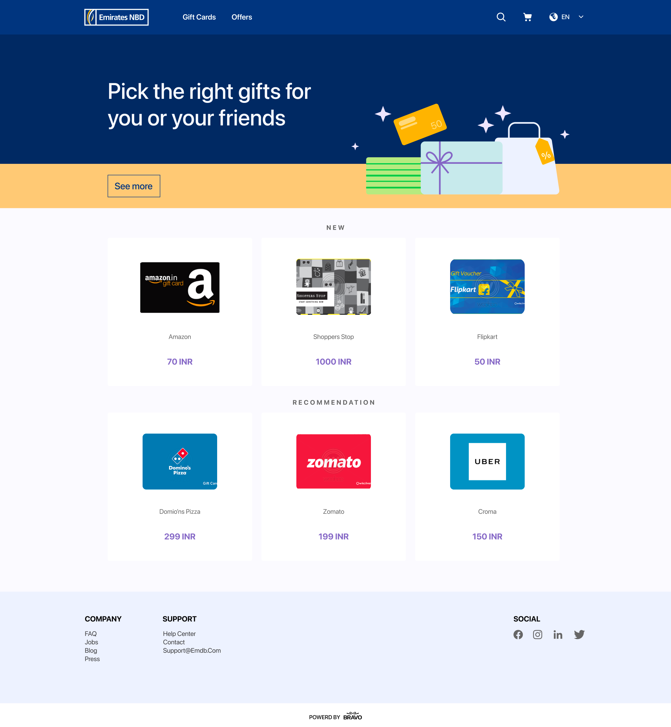
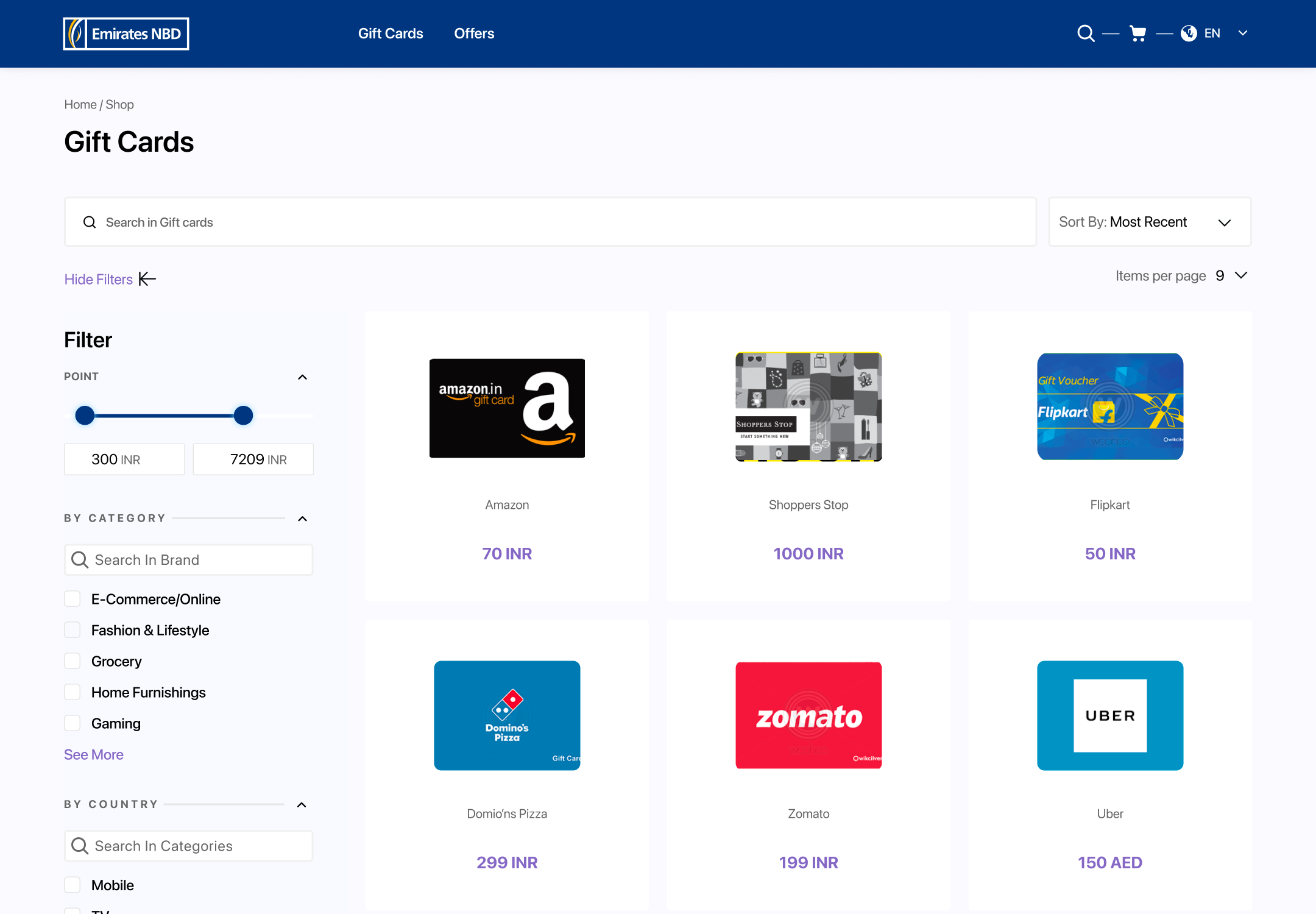
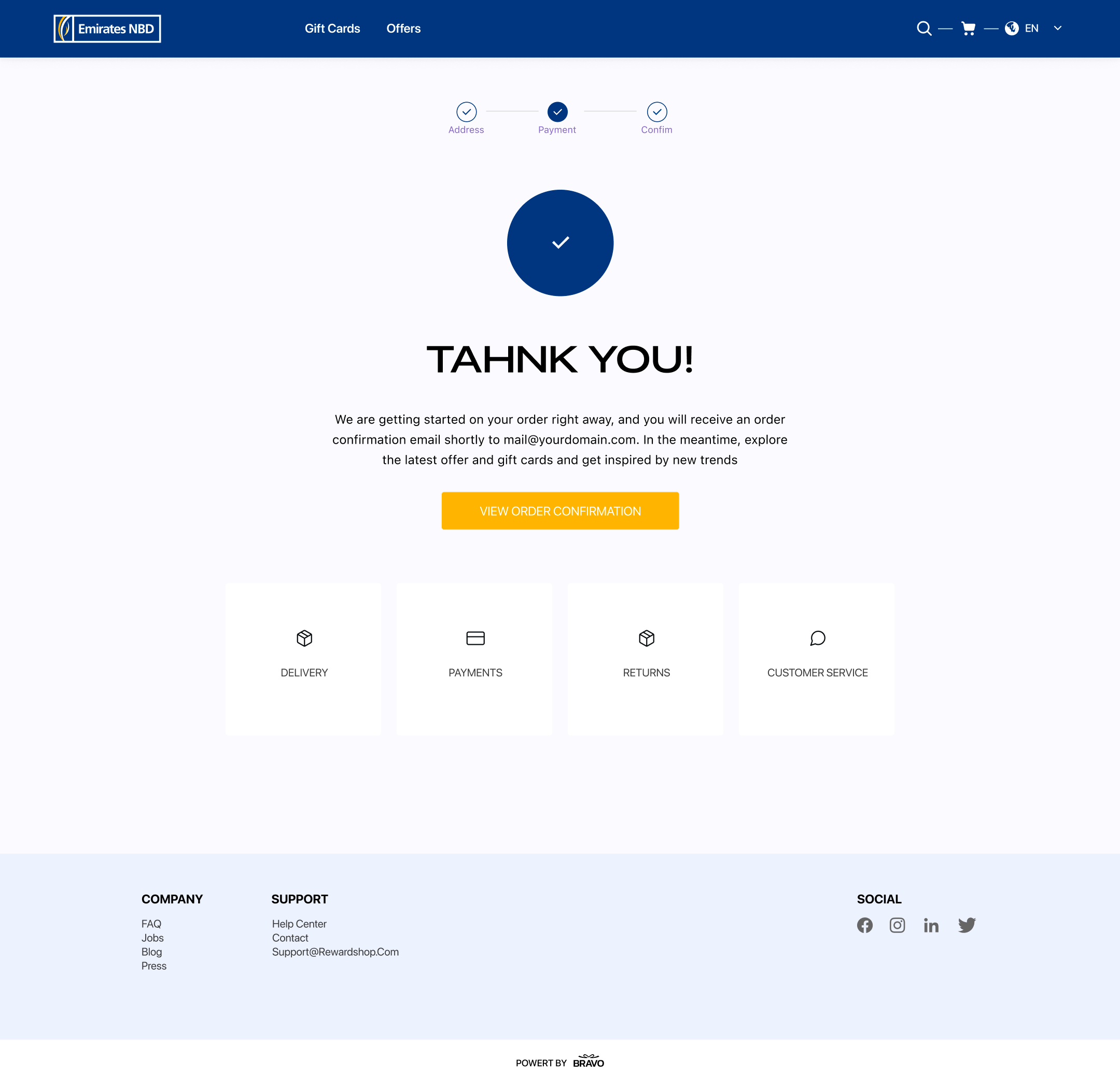
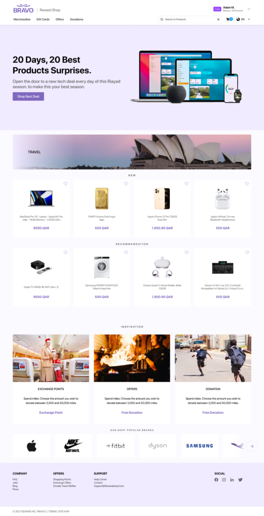
Bravo Reward Shop is a B2C gift card platform where end users browse, purchase, and redeem digital gift cards from hundreds of brands. It’s a full e-commerce experience: catalog browsing, filtering, wishlists, cart, checkout, and a dedicated gift card claim flow.
The business model adds a layer of complexity: Bravo sells the platform to B2B clients (companies) who white-label or co-brand it for their employees. So the design had to serve two audiences simultaneously — end users shopping for gift cards, and business clients who need their brand identity reflected in the experience.
02 — The core design challenge
The hardest problem wasn’t any single screen — it was systemic: how do you build one product that looks like multiple different products, without rebuilding anything?
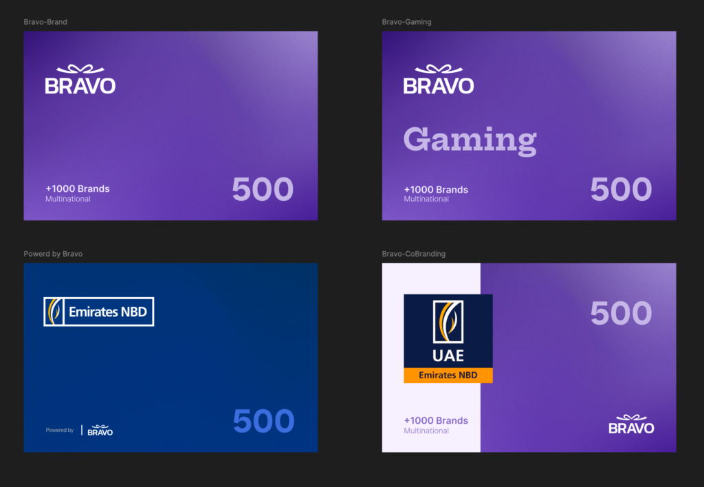
Bravo had four contract tiers, each requiring a different level of brand expression across every touchpoint:
- Full Bravo Brand → Bravo’s own identity and purple palette
- Co-Branding → client’s logo and colors alongside Bravo
- Powered by Bravo → client brand dominant, Bravo visually secondary
- Gaming → dark-themed variant for gaming reward programs
This touched everything: gift card artwork, email templates, web/mobile UI shell, and the claim certificate flow. The web platform also had to dynamically swap brand identity from the same codebase and URL based on which client was active — no page rebuild.
03 — What I delivered
As lead designer, I owned the full scope from day one. Here’s what I built:
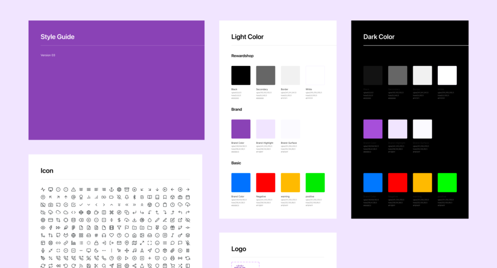
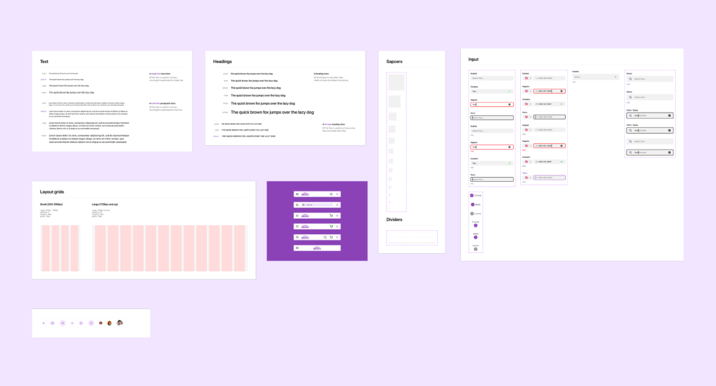
1- Token-based Design System
Colors, typography, icons, components — all built as swappable variables so any brand tier works without breaking layouts. Includes full dark mode token set.
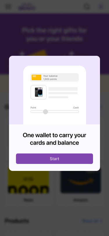
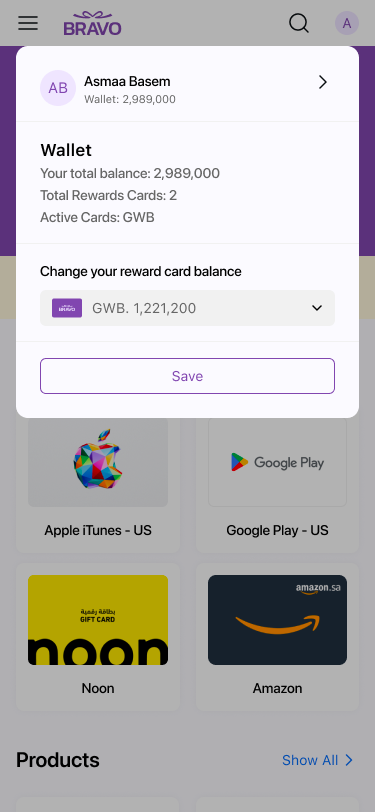
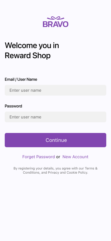
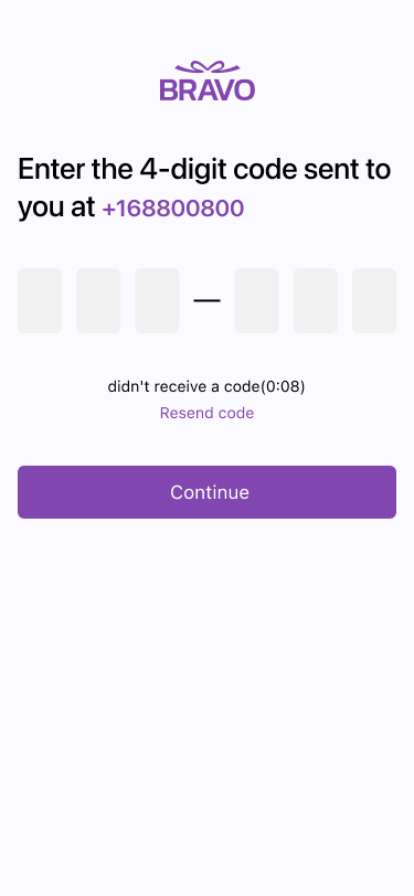
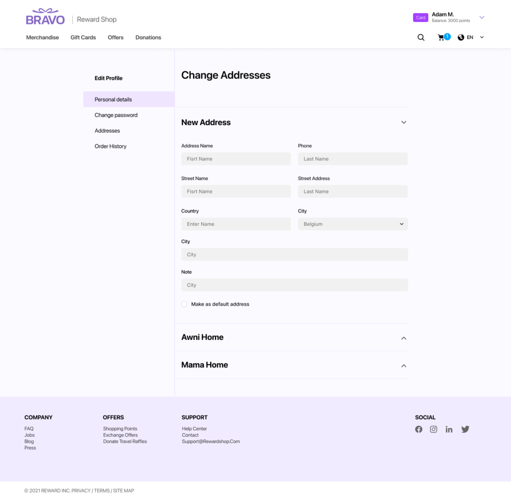
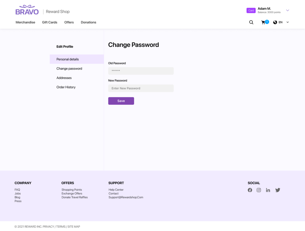
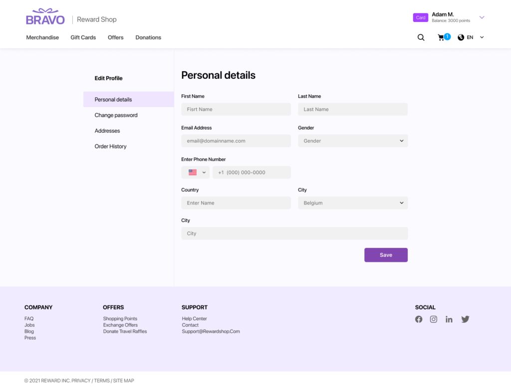
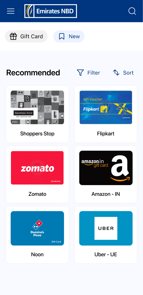
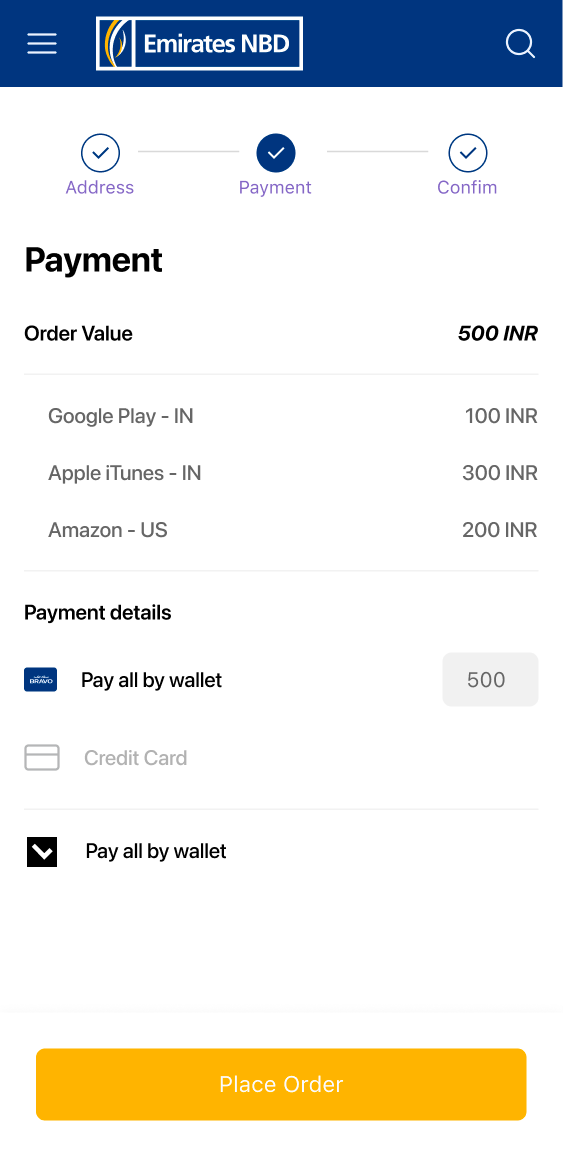
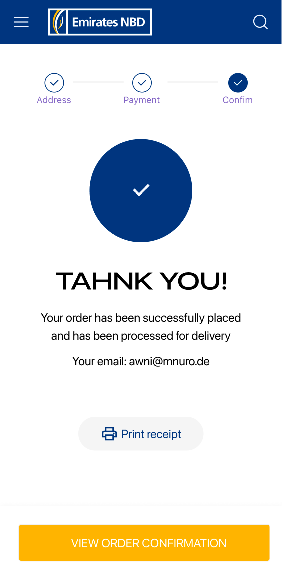
2- Mobile Experience (40+ screens)
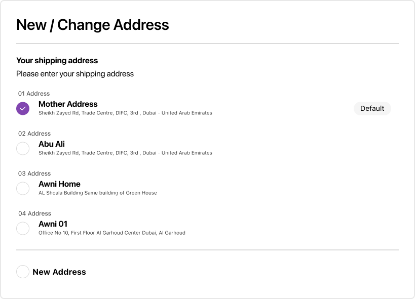
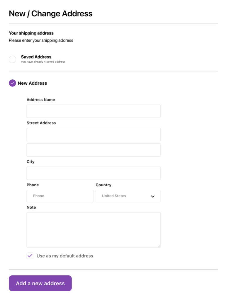
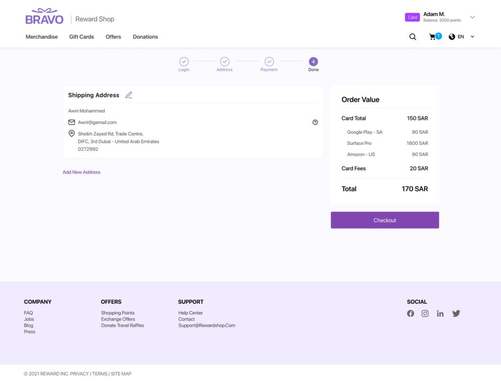
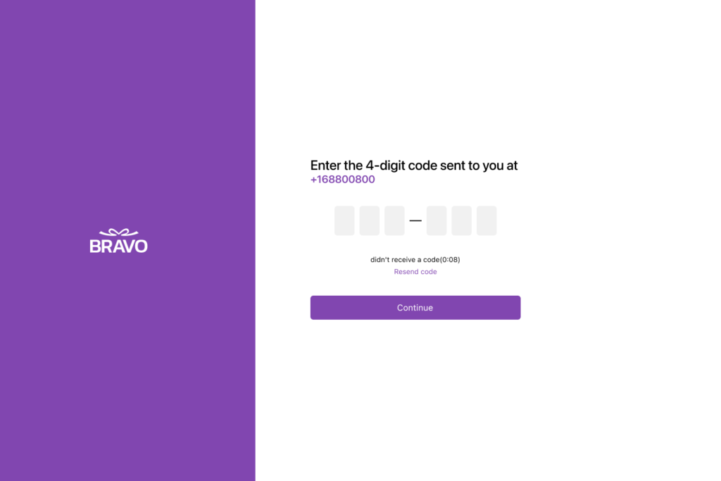
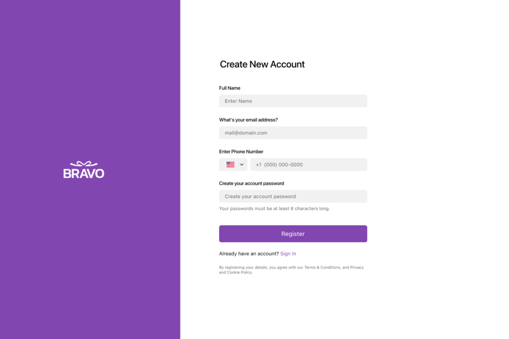
Complete iOS flow: onboarding, auth, catalog, filters, product detail, cart, wishlist, checkout, claim, and full account management. Every state designed — empty, loading, error, edge cases.

3- Desktop Web Platform
Full 1440px adaptation including dark mode variant and Arabic RTL home page. Dynamic co-branding renders different identities from the same page.
4- Gift Card Design Variants
Shared structural template, four brand expressions. Co-brand variant governed by proportion and color rules I defined to ensure consistency across any client pairing.
5- Email Templates
3 types (Bravo, Co-Brand, Claim) designed at mobile width. Optimized hierarchy to minimize steps from email open to gift card claim.
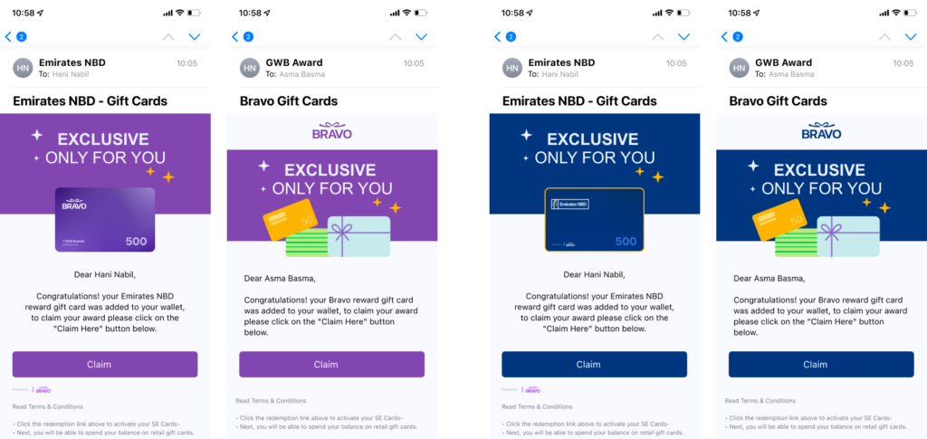
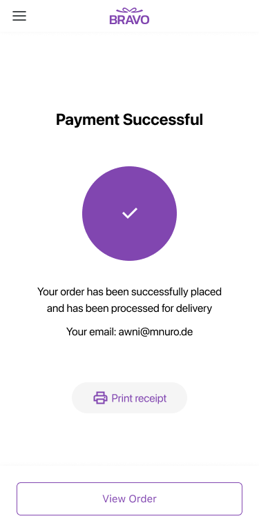
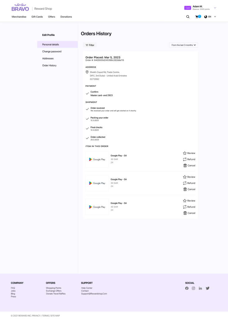
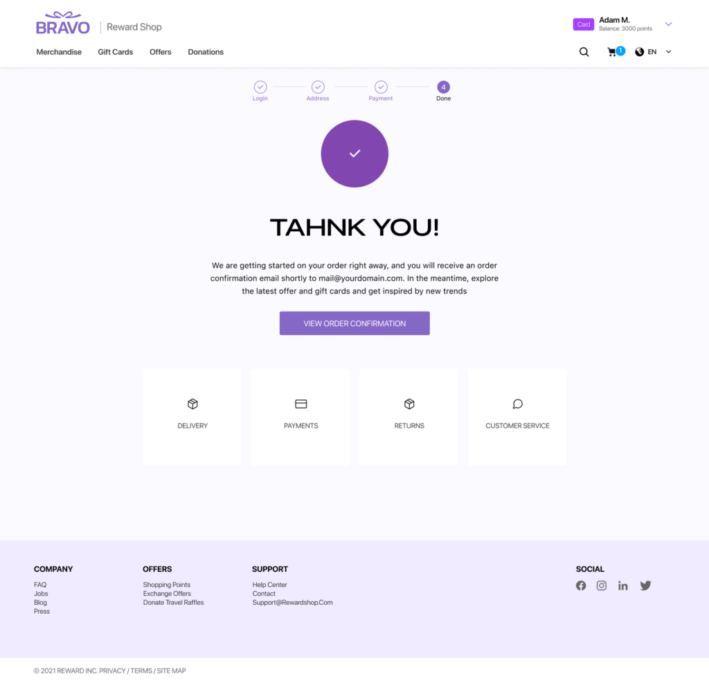
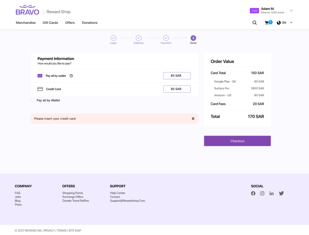
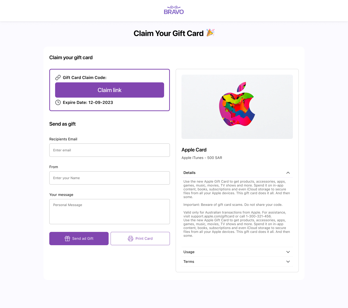
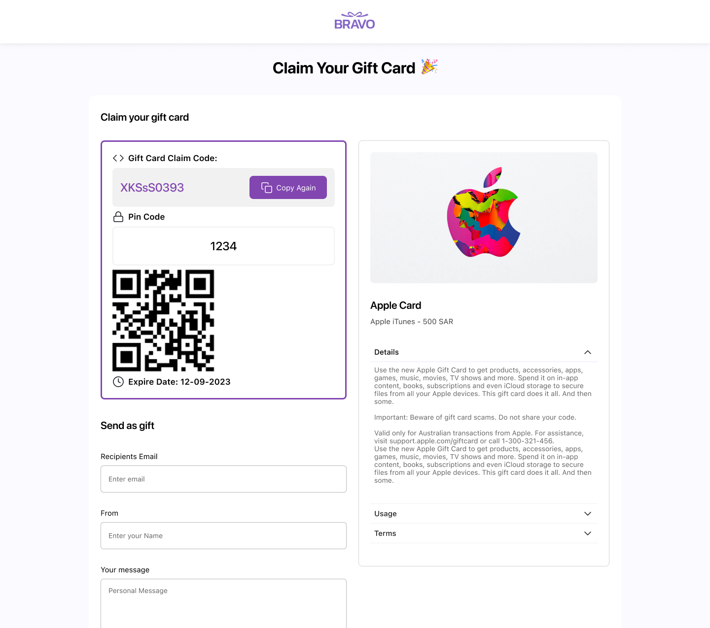
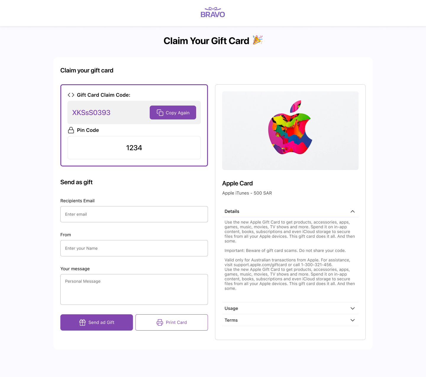
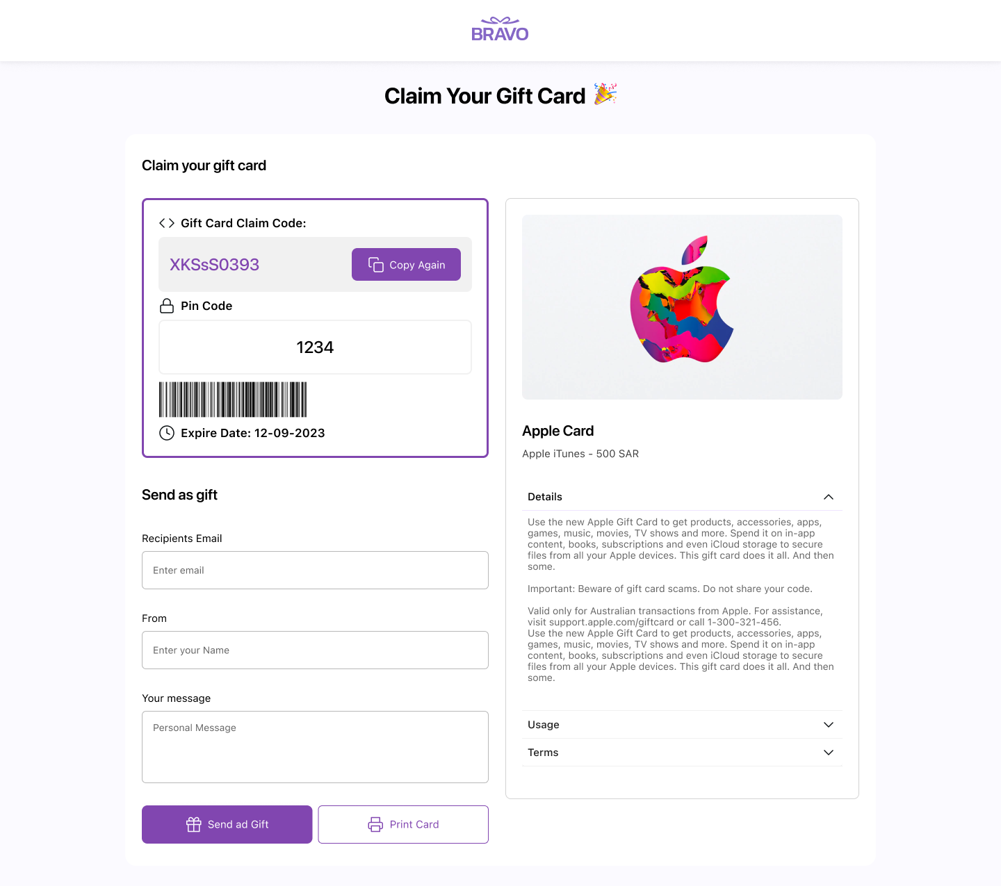
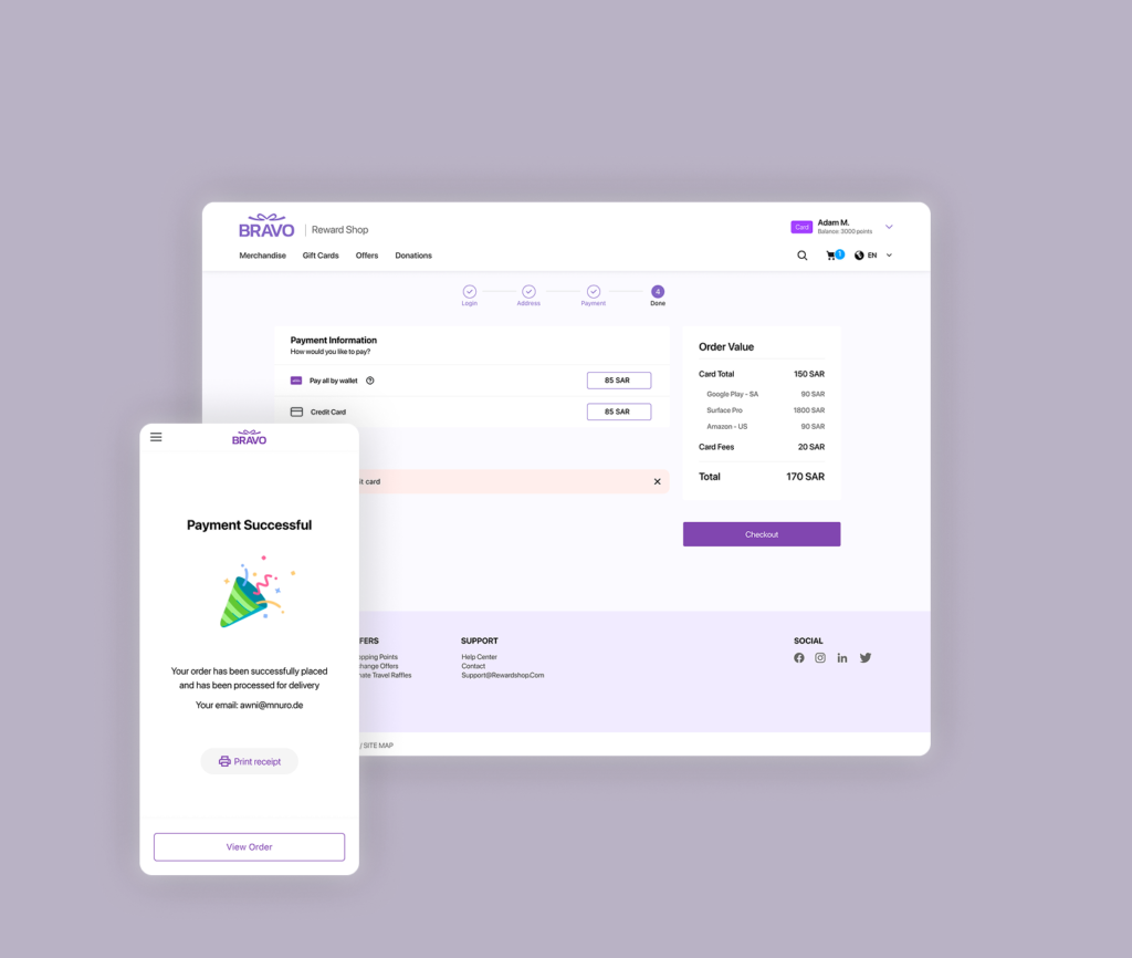
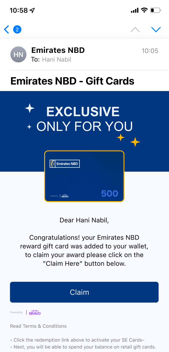
6- Certificate & Claim Flow
Dedicated web experience for the reward moment. Handles multiple voucher types, branded pre-loading states, celebratory UX at the point of highest user anticipation.
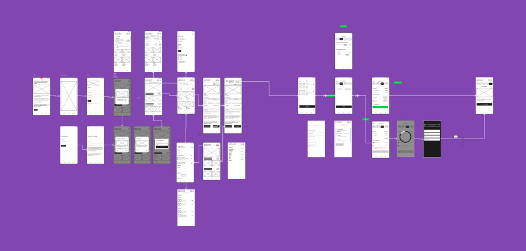
7- Full User Flow Diagram
Figma diagram mapping every entry point, state, and decision. Used as the shared blueprint between design, product, and engineering before any screen work.
8- Clickable Prototype
Complete mobile journey prototype for stakeholder reviews and developer handoff.
04 — How I worked
Before any screen work, I made three decisions that shaped everything that followed:
Mobile first, then web
The most constrained canvas came first. Web adaptations expanded from established patterns rather than starting from scratch.
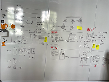
User flow first.
I mapped the entire product journey before opening any design frame. This forced alignment on scope with PM and stakeholders before visual work began, preventing scope gaps and rework.
Design system before screens.
With co-branding as a core requirement, I built the full token system first — including the variable structure for brand switching. Every screen then built on a consistent, flexible foundation.

Errors, edge cases
All states, not just happy path. Blank states, loading, errors, edge cases — non-negotiable in an e-commerce context where every dead end is a lost conversion.
05 — Outcome
The full product shipped to production. Key results:
The co-branding system works as designed
the same product deploys with different brand identities by swapping tokens, zero redesign needed per client.
Arabic RTL version
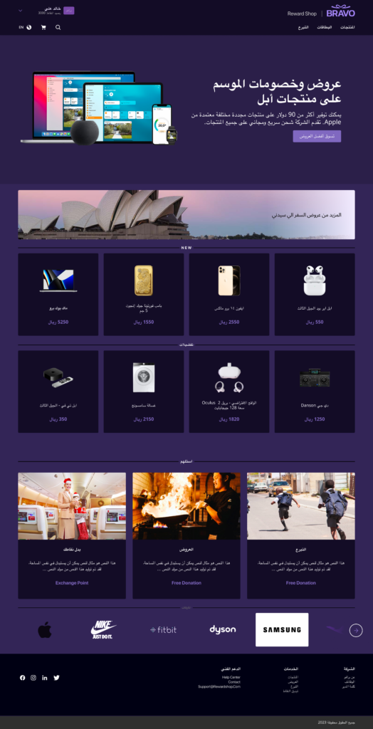
demonstrated internationalization readiness from the token and component level — not retrofitted.
Claim flow optimized for minimal friction
from email open to gift card access in as few steps as possible, reducing drop-off at the critical reward moment.
06 — Key takeaways
What this project reinforced:
A token-based design system isn’t optional when co-branding is a product requirement
it’s the architecture that makes the feature possible.
Designing for RTL and dark mode from day one is far cheaper than retrofitting
both require decisions at the token and component level that are expensive to change later.
The claim moment is a product experience, not a utility screen
Designing it with delight matters — it’s the peak emotional moment in the user journey.