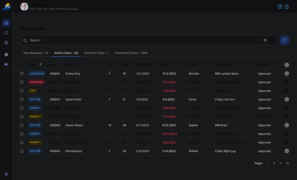
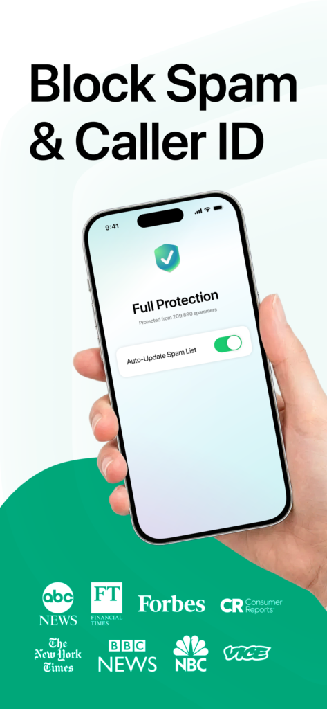
Privacy-First Caller ID & Reverse Lookup
Redesigning the UX to grow ARR from $10K to $115K in 6 months
Role:
UI/UX Designer — Design strategy,
product decisions, A/B testing
Scope:
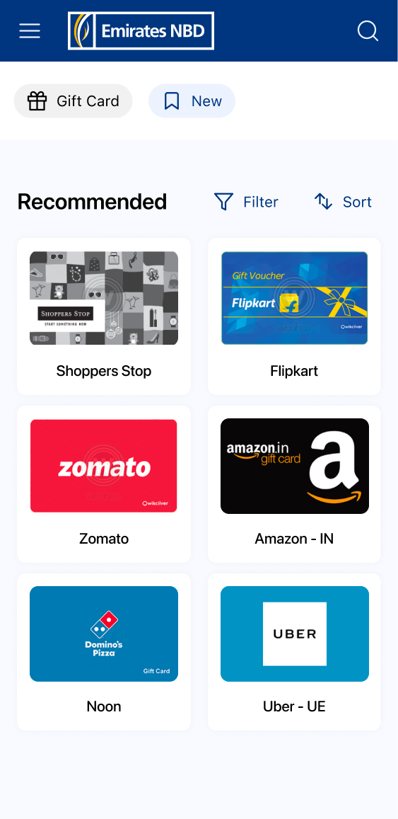
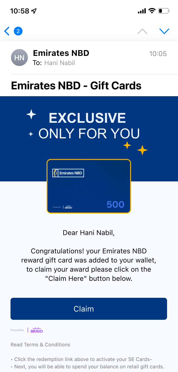
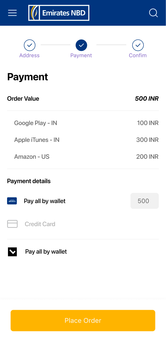
Design System, Mobile (40+ screens), Web, Emails, Gift Cards, Certificates
Platforms:
iOS (iPhone)
Impact:
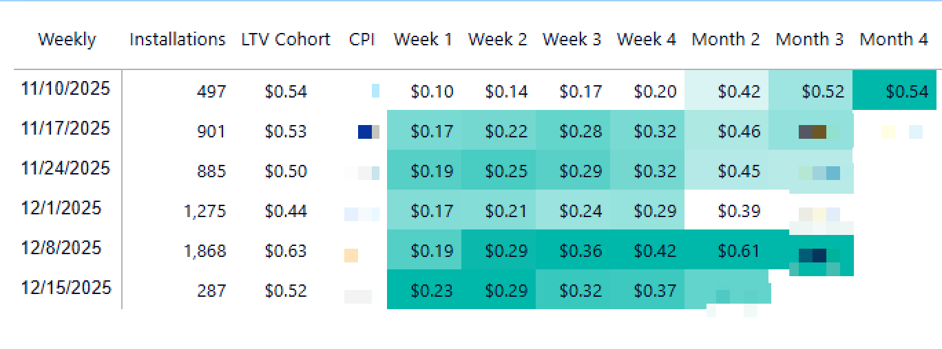
ARR: $10K → $115K+ | #5 Top Free in Kuwait | LTV > CPI by Week 4
Tools:
Figma, Miro ,Zoom, Slack
Status:
Shipped to production
01 — The Problem
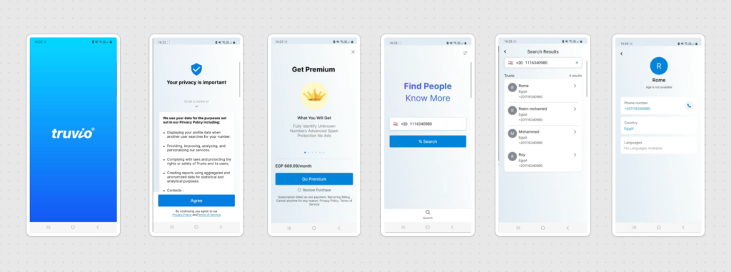
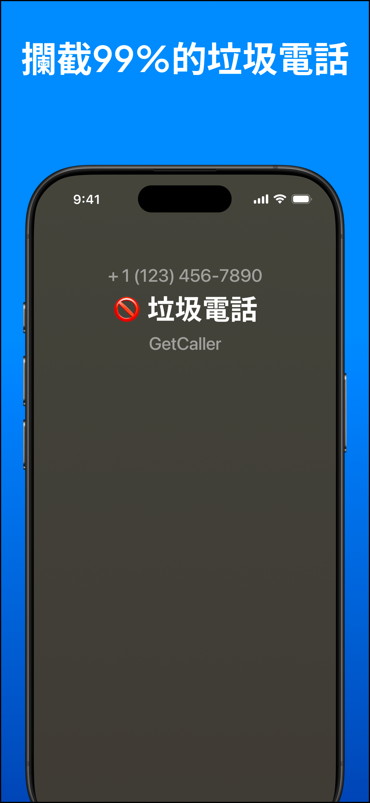
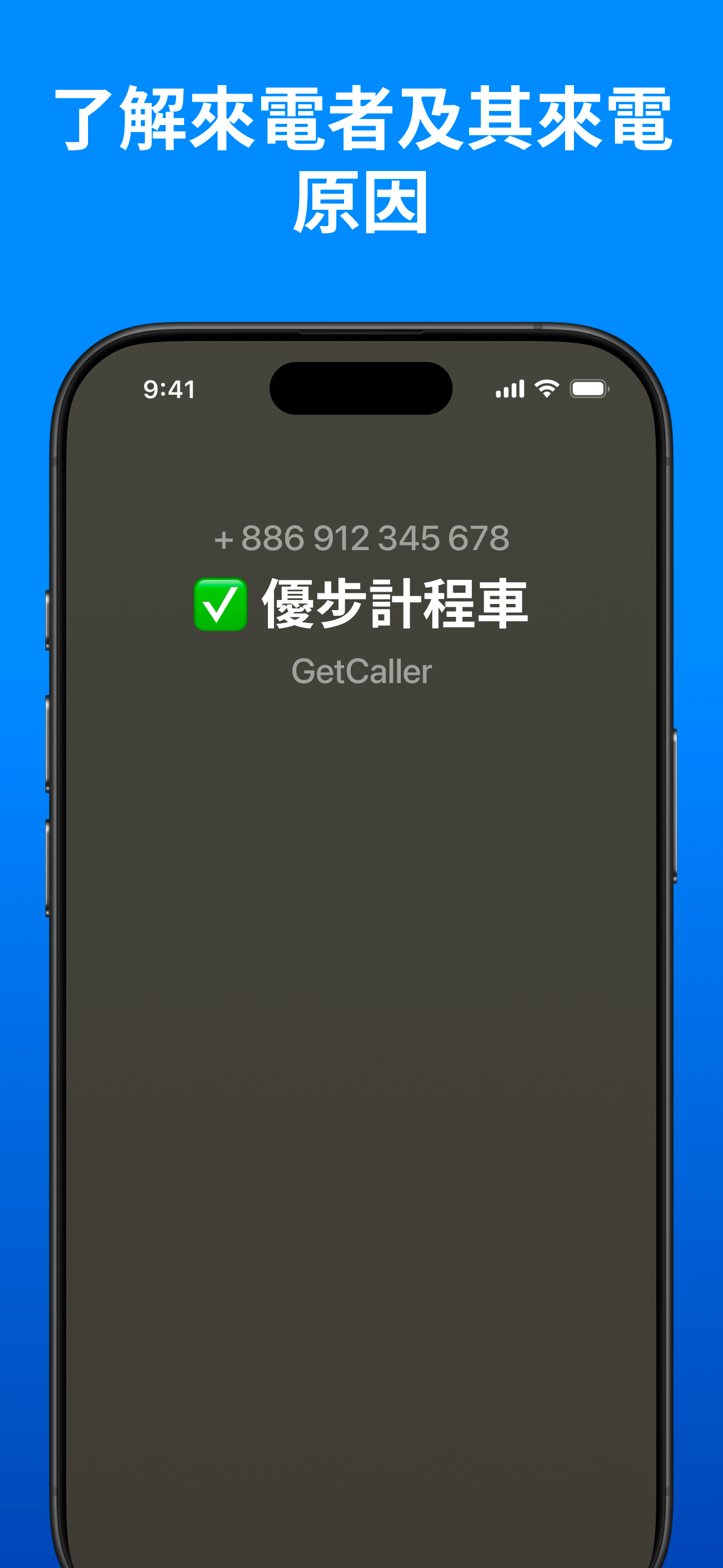
GetCaller is a privacy-first caller ID app — it identifies unknown callers and blocks spam without selling user data. When I joined as UX lead in August 2025, the app was called Truvio and was barely sustainable at ~$6K ARR. I found six problems:
Flat, generic UI
Didn’t look or feel like a native iOS app. Gradient splash screen, no visual identity.
Confusing premium
“Go Premium” shown before users experienced any value, with vague benefits in small text.
Bad upsell timing
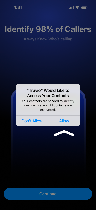
Tracking permission and premium prompts fired on first launch, before the user had done anything
Privacy policy wall
A full screen of legal text as the third screen in onboarding. Users saw more legalese than product.
Zero ASO localization
One generic App Store listing for all markets globally
Resources spread thin
Building Android and iOS simultaneously, excelling at neither.
The technology worked. The privacy value proposition was real. But the product looked, felt, and behaved like a prototype — not a premium iOS app. It needed design leadership, a rebrand, and a focused strategy.
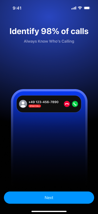
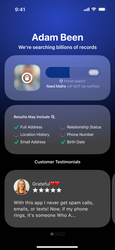
BEFORE (Truvio)
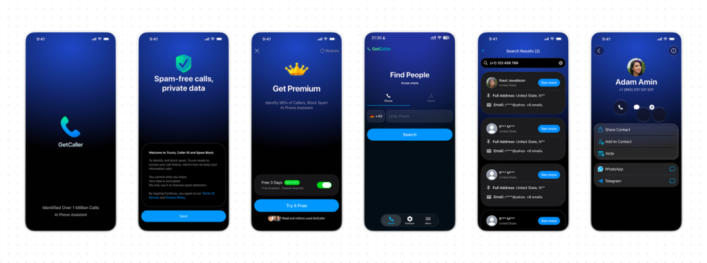
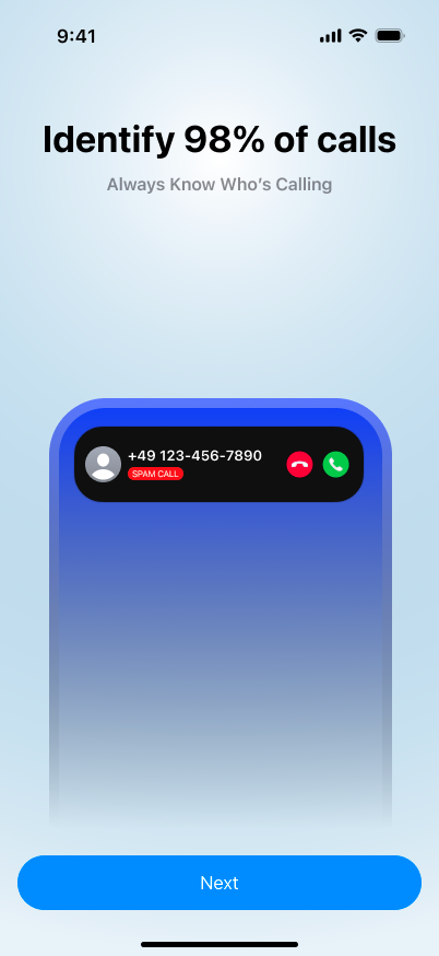
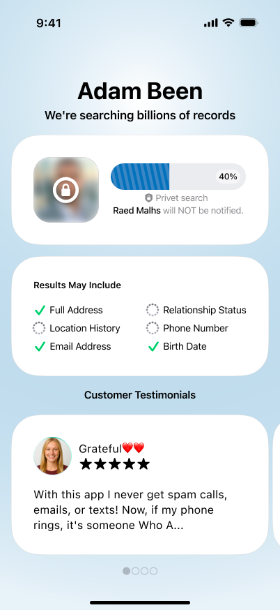
AFTER (GetCaller)
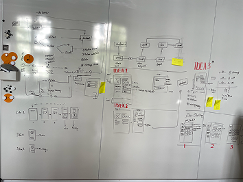
02 — My Thinking
I made three strategic decisions before designing a single screen.
1
Kill Android, focus on iOS.
The team was splitting effort across two platforms and succeeding at neither. iOS had stronger subscription behavior and more growth potential. This was the hardest sell internally, but the most impactful decision I made.
2
Rebrand and redesign from flat to iOS-native
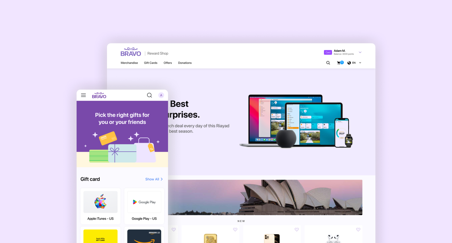
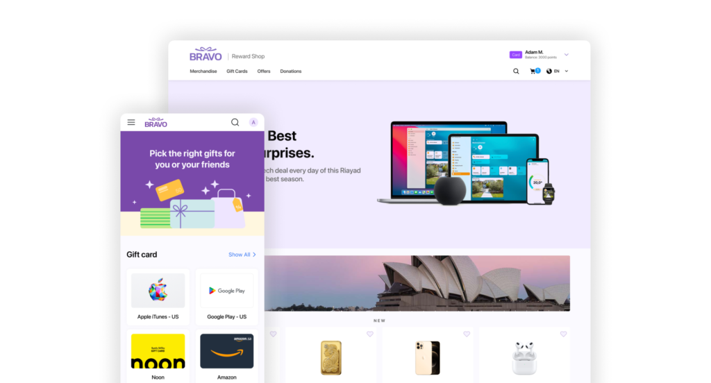
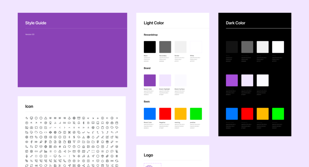
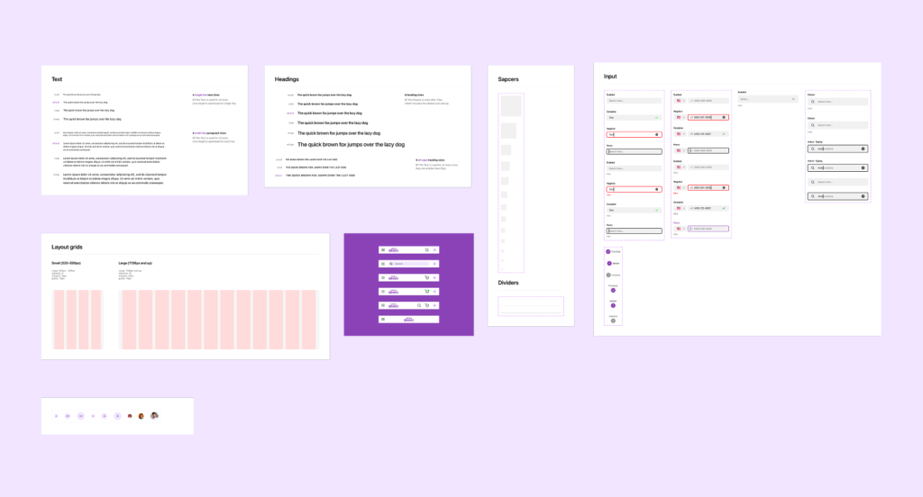
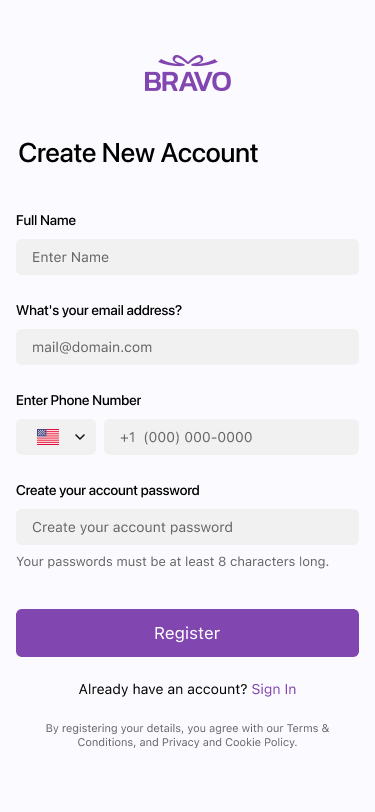
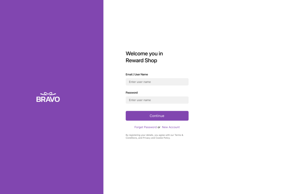
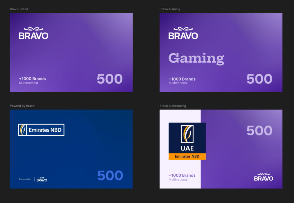
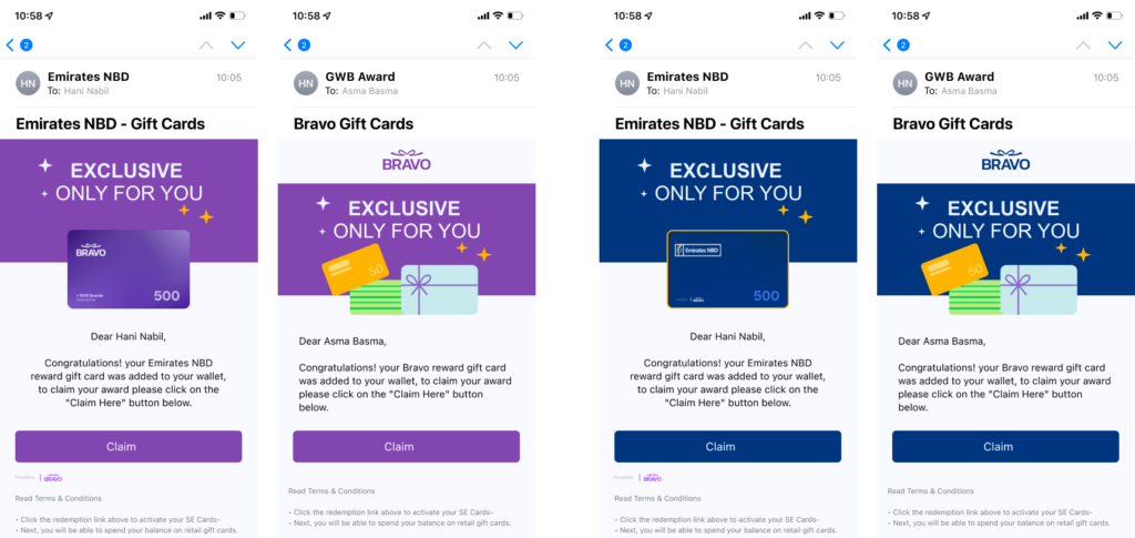
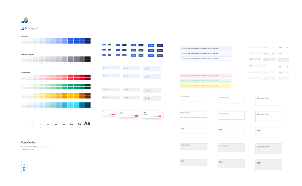
Truvio looked like a cross-platform prototype. I rebranded the product to GetCaller and rebuilt it with SF Pro typography, native navigation, and a token-based design system supporting light/dark mode and Arabic RTL from day one. New name, new identity, new experience.
2
Build A/B testing before redesigning premium
I refused to redesign the subscription flow based on opinion. I built an A/B testing environment first so every premium iteration could be measured.
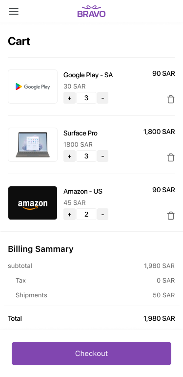
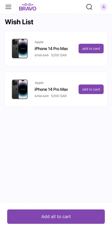
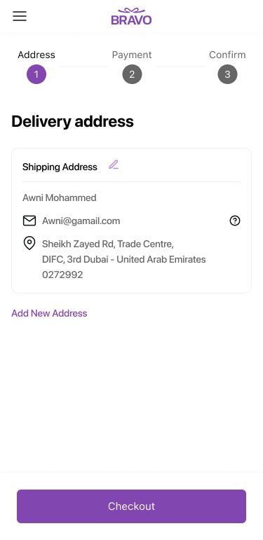
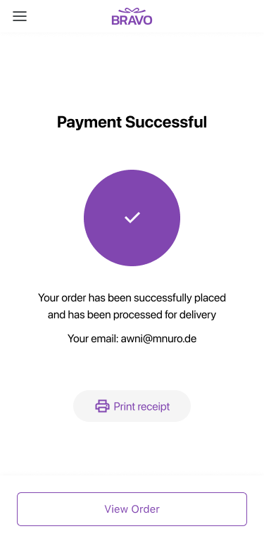
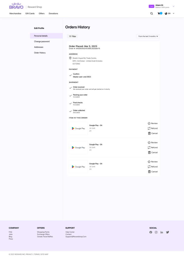
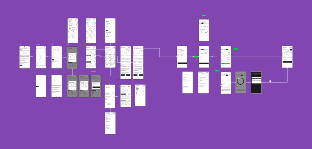
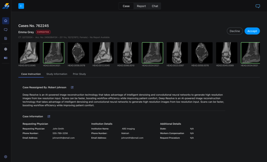
03 — What I Redesigned
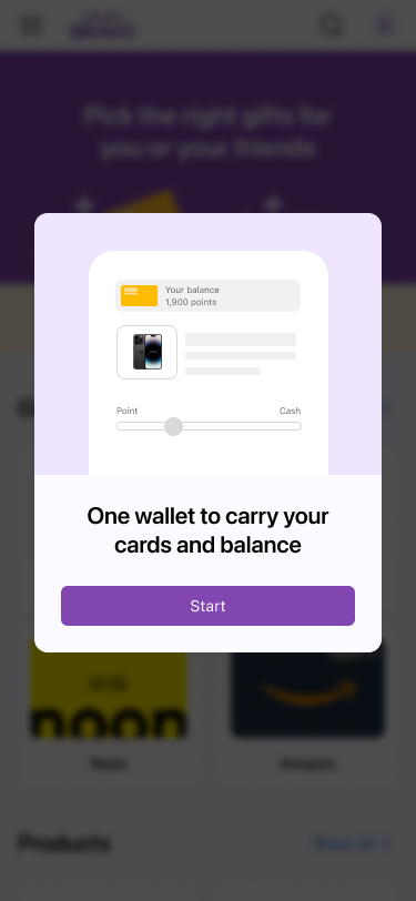
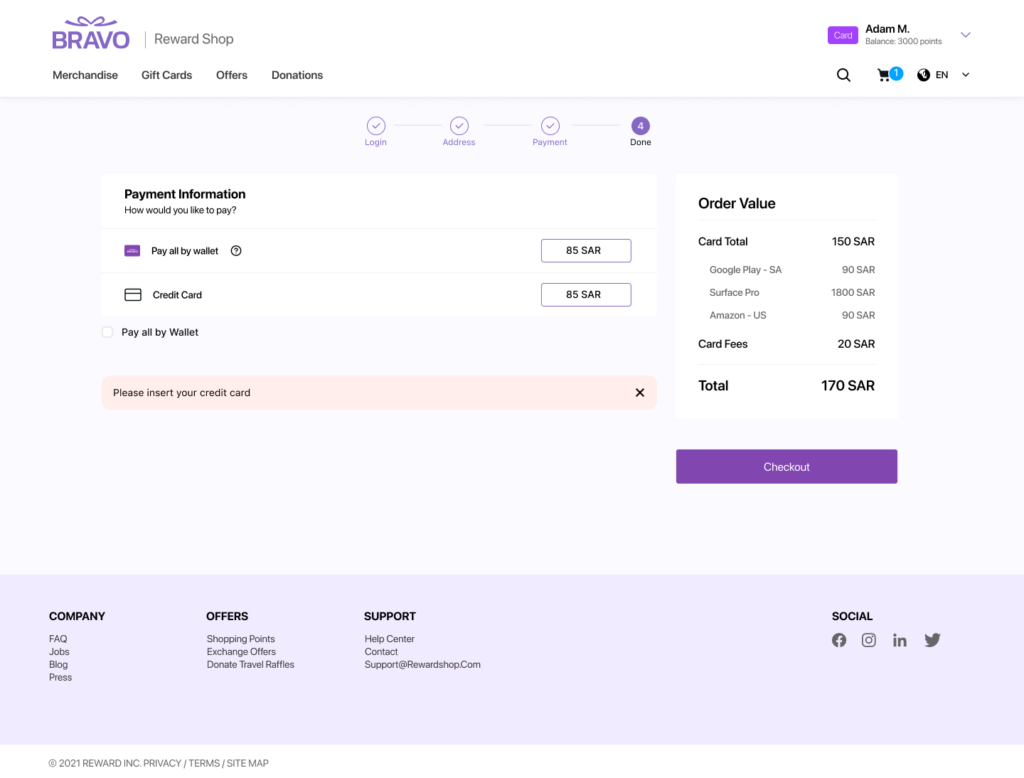
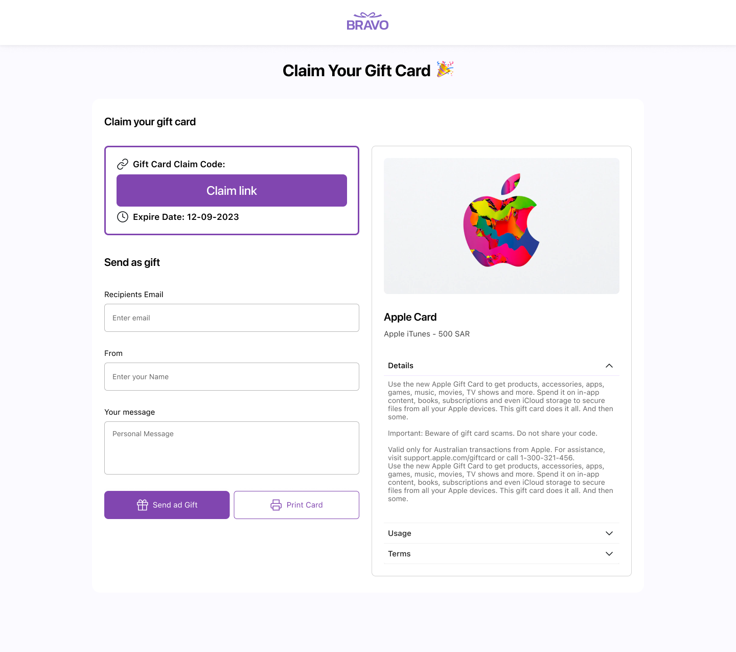
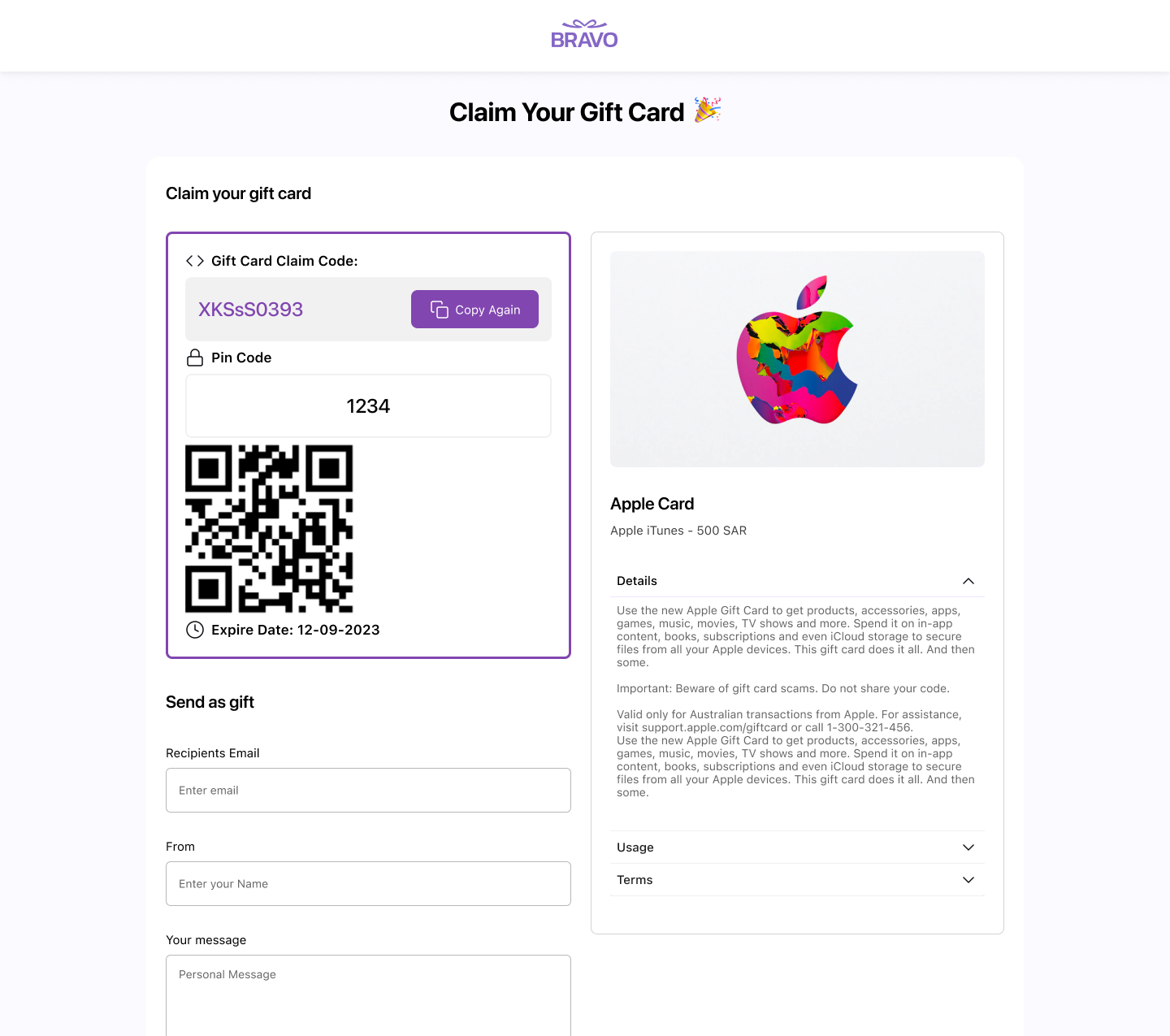
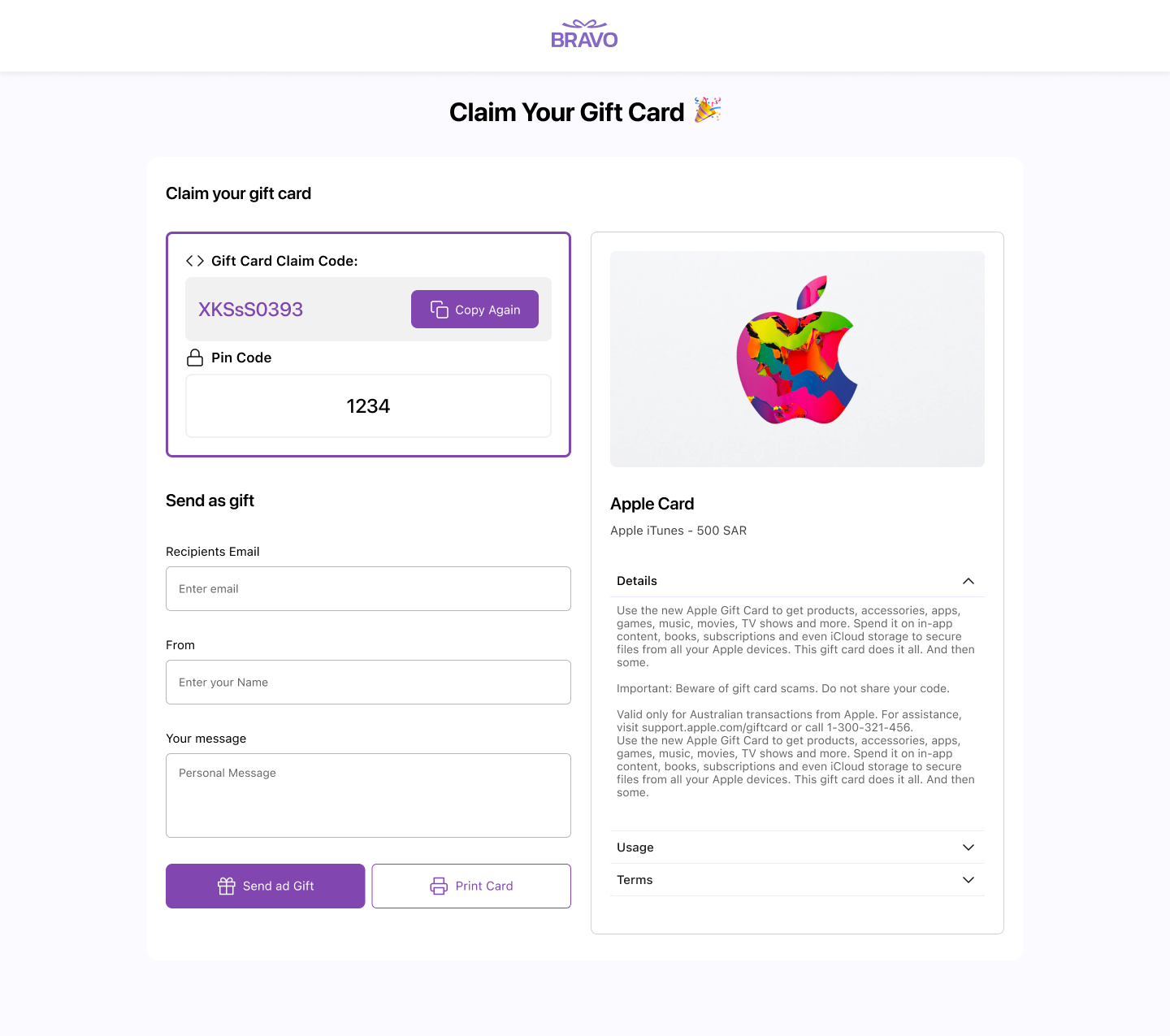
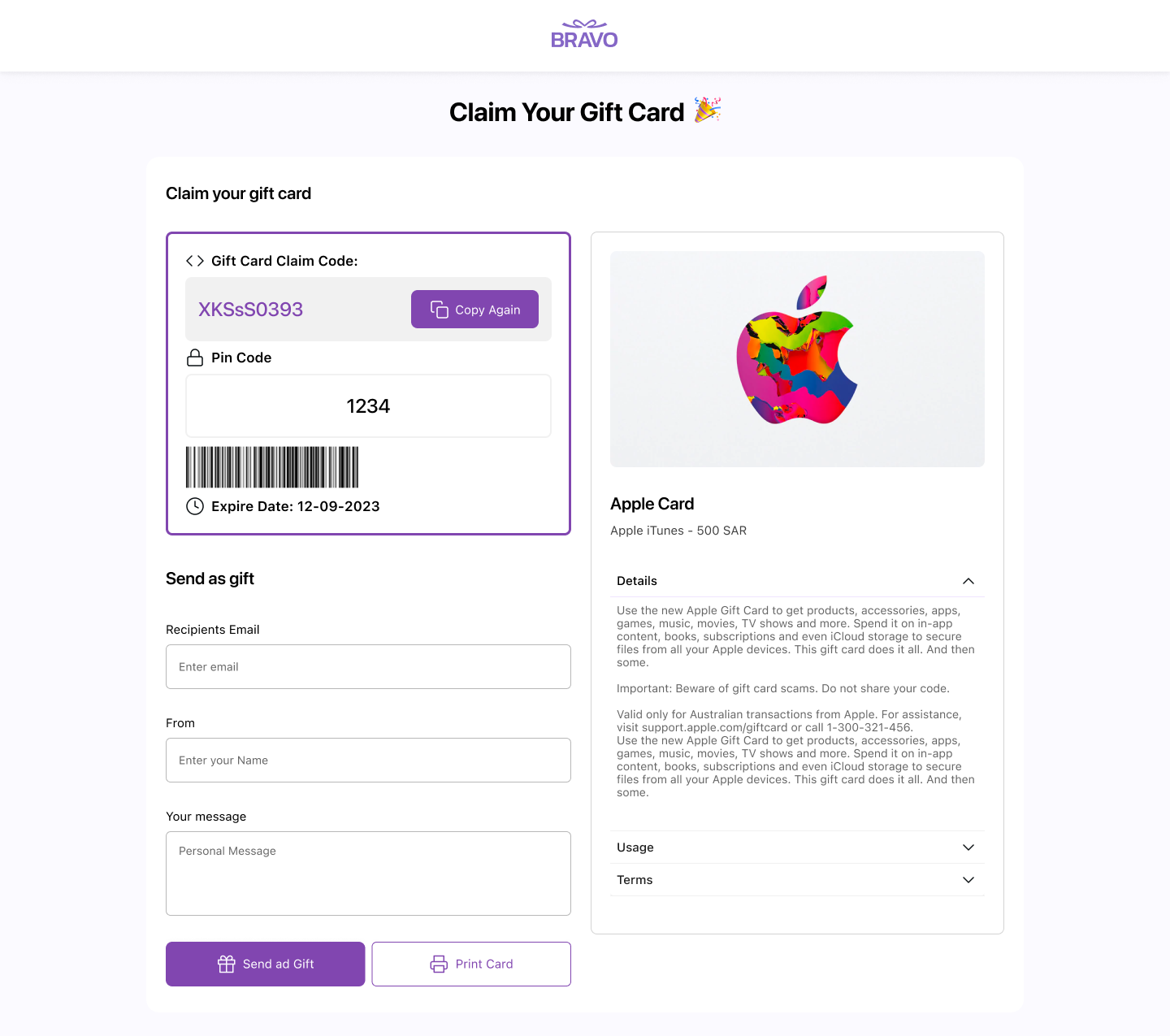
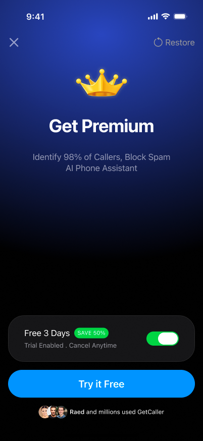
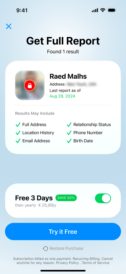
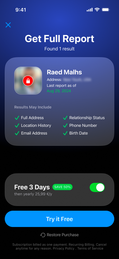
Premium & upsell system.
6 major iterations, 20+ screen variants, all A/B tested. I fixed upsell timing to trigger at value-gap moments, clarified the value proposition, and redesigned pricing presentation.
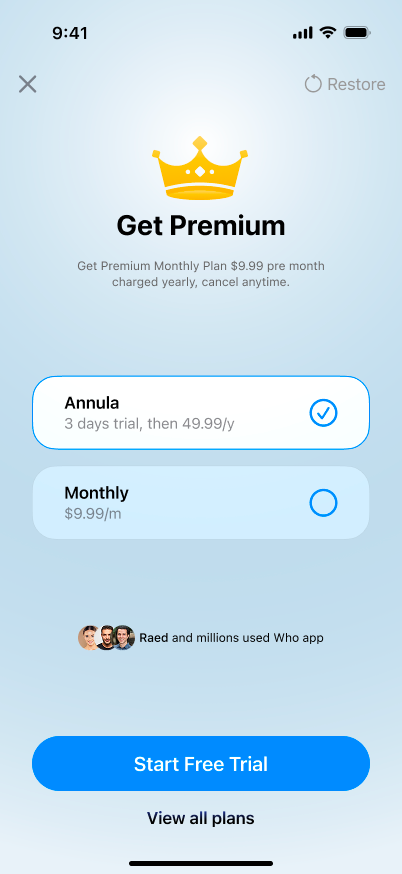
A/B
VARIANT A
CONTROL

A/B
VARIANT B — WINNER ✅
Converted by
38% LTV
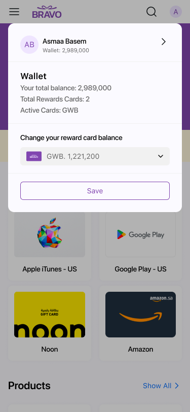
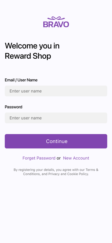
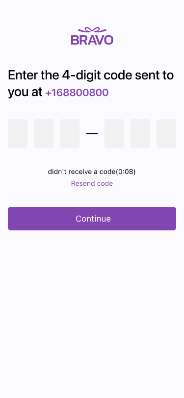
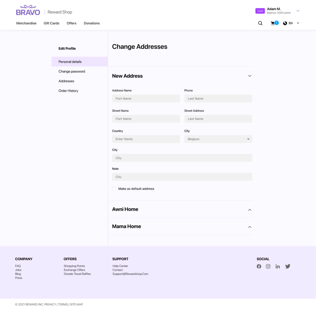
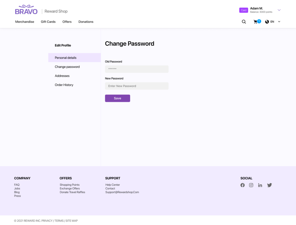
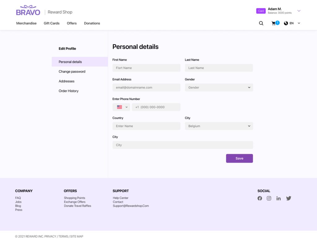
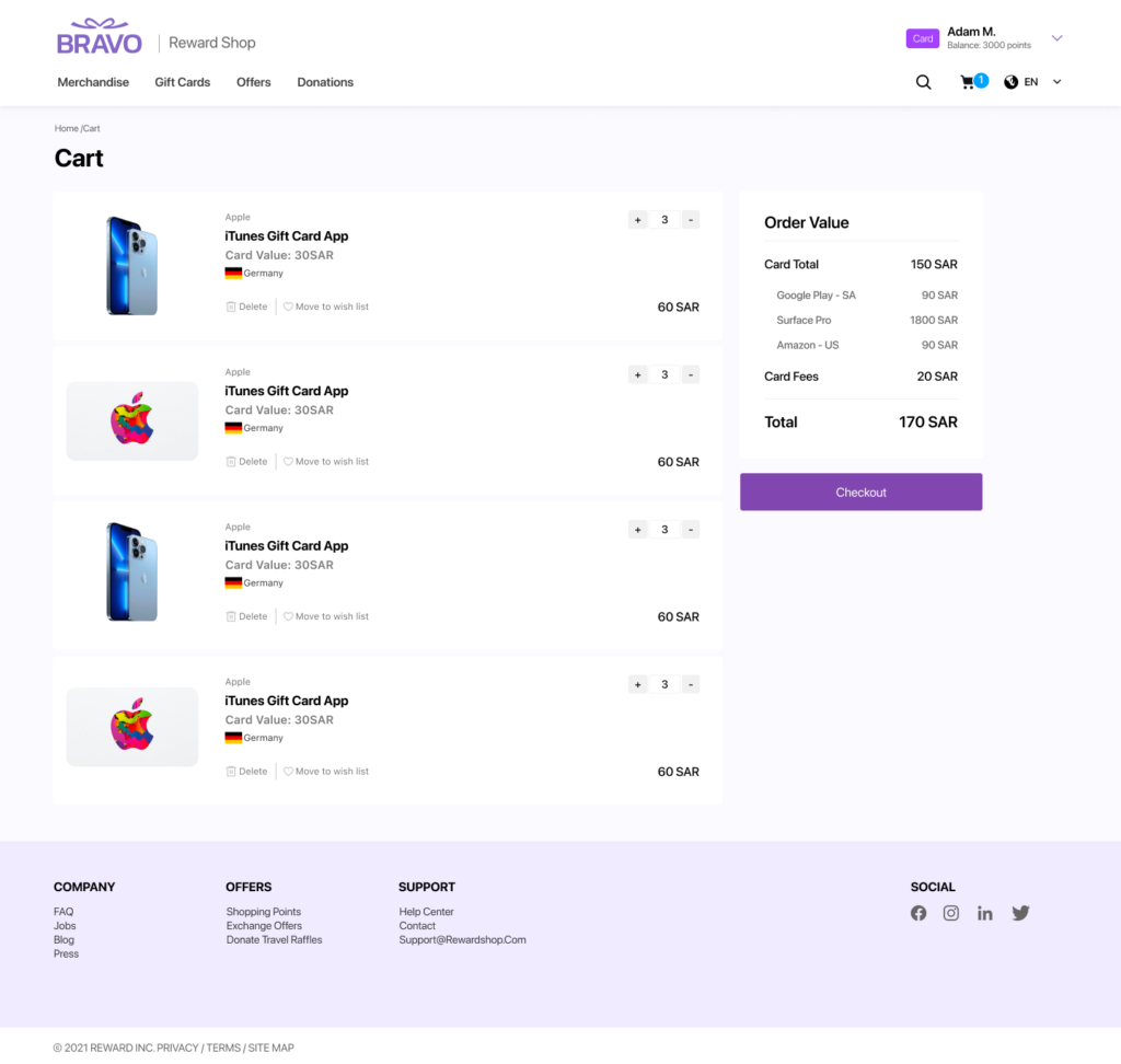
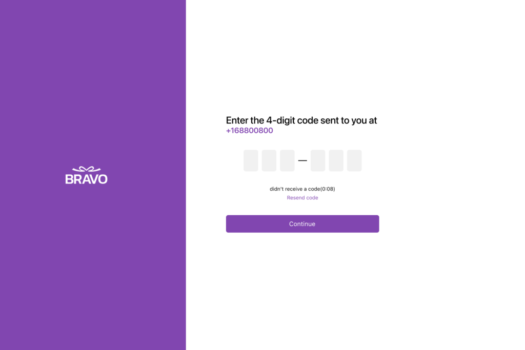
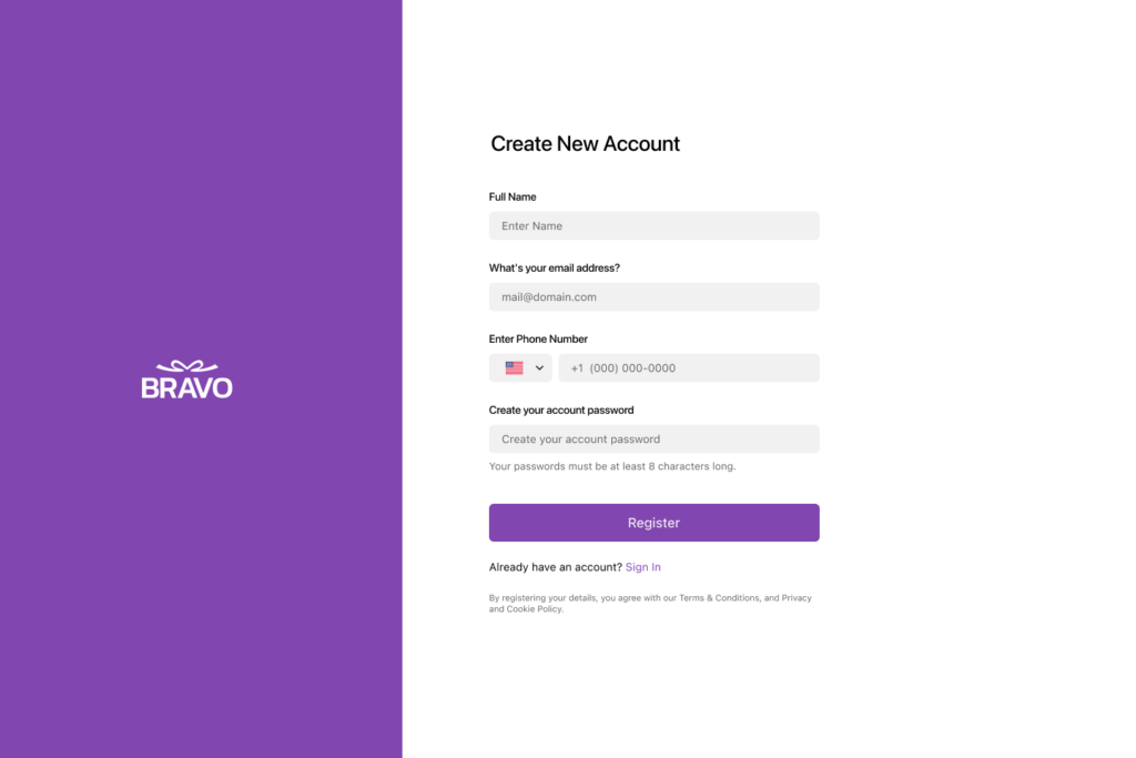
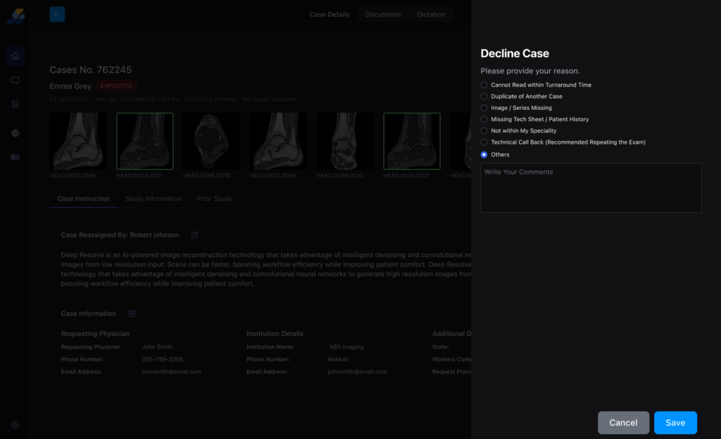
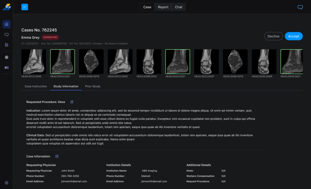
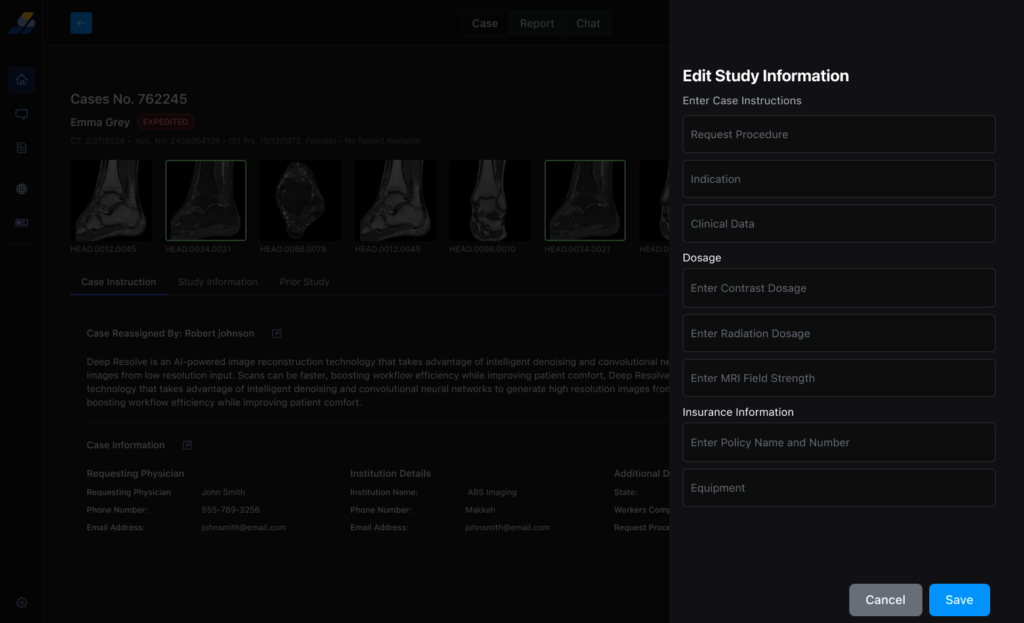
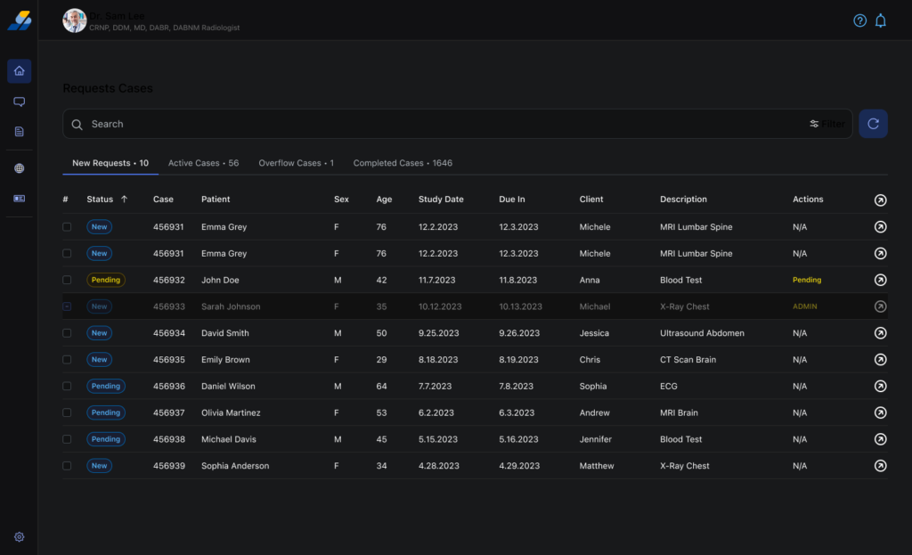
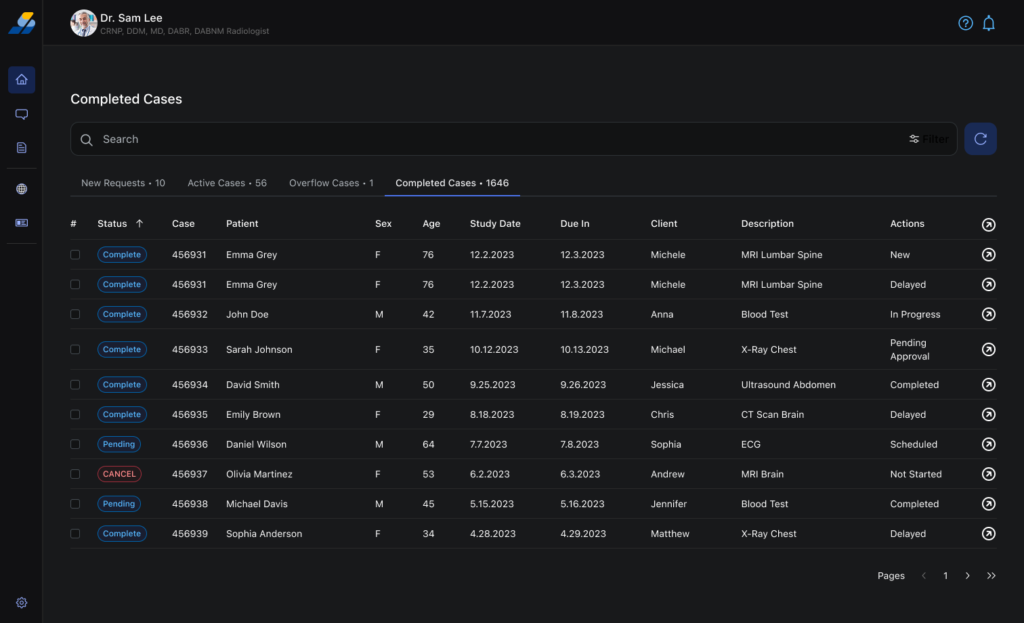
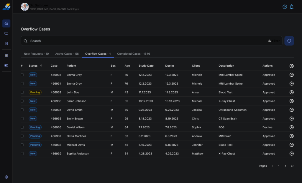
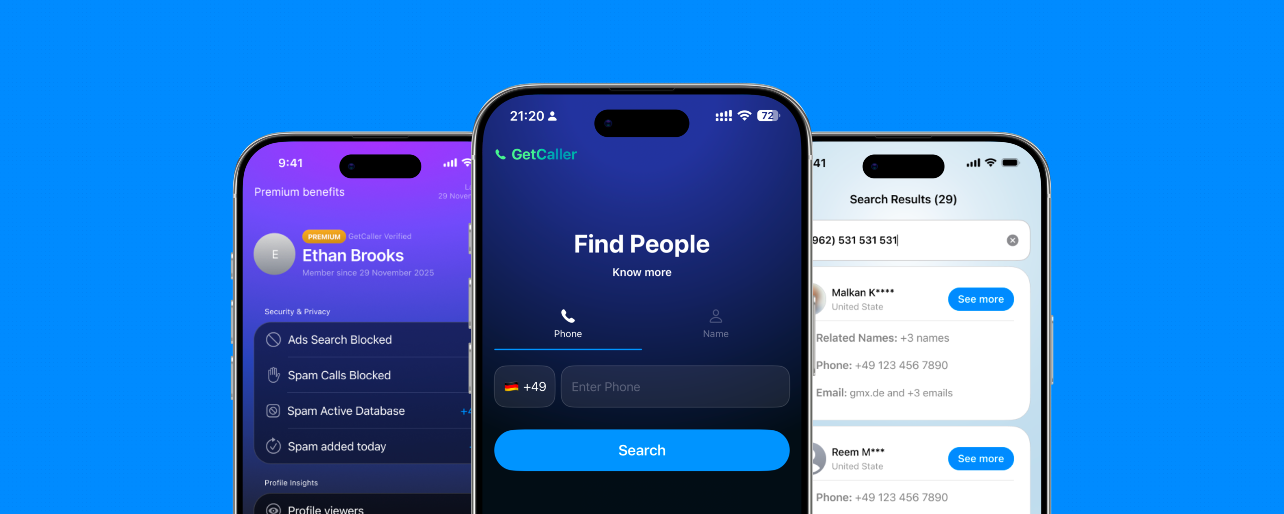
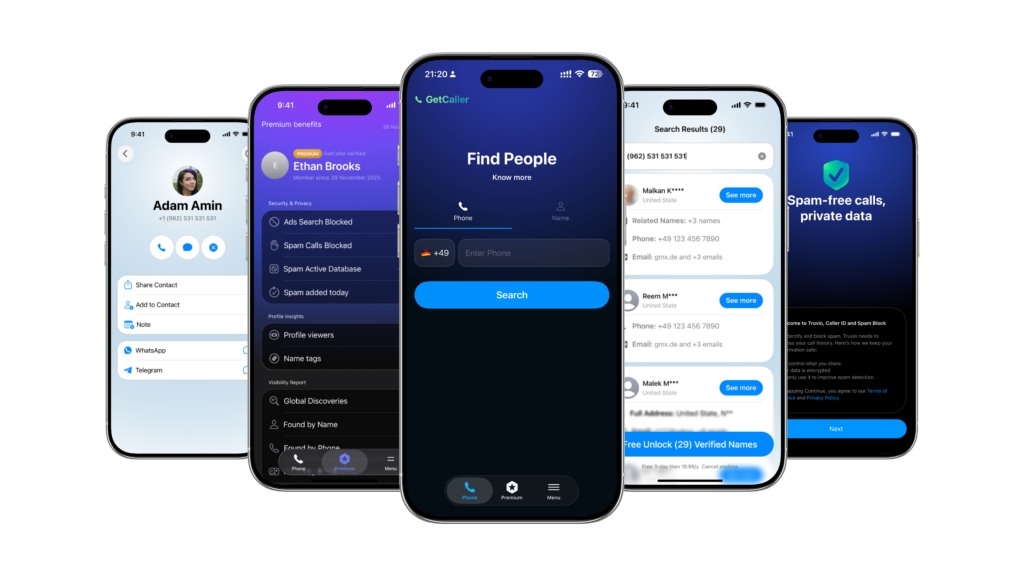
Core app experience
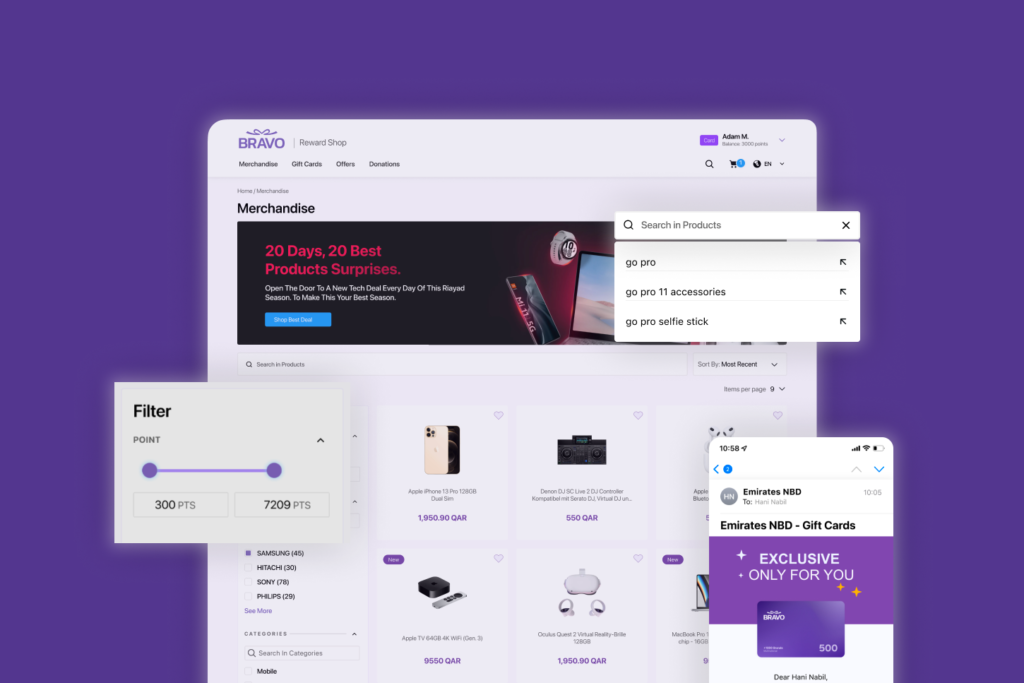
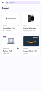
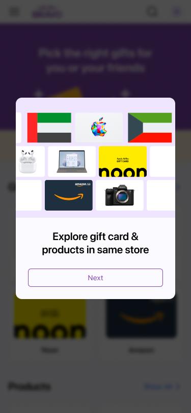
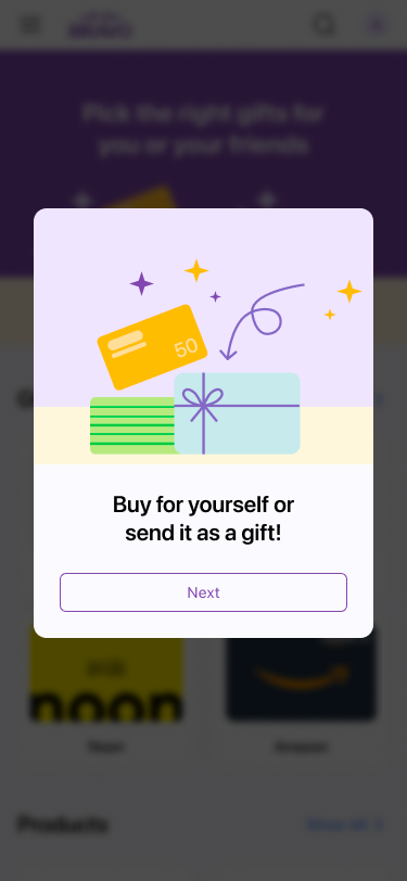
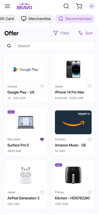
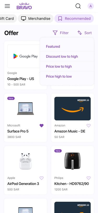
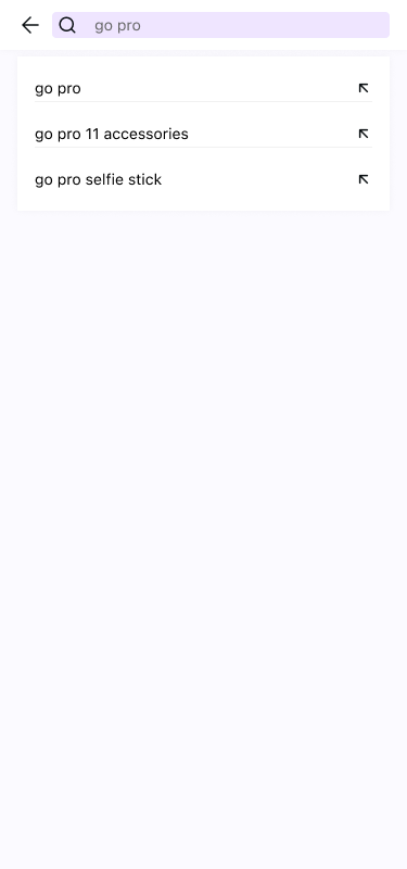
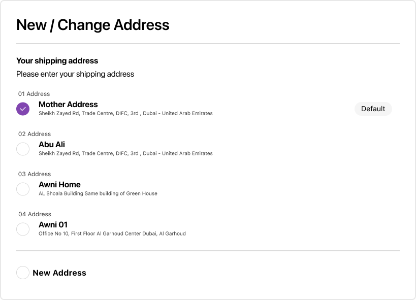
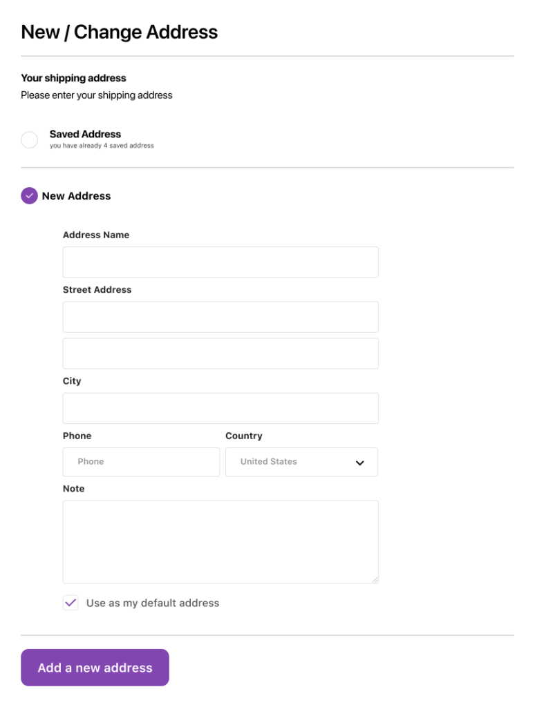
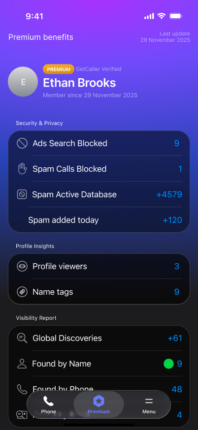
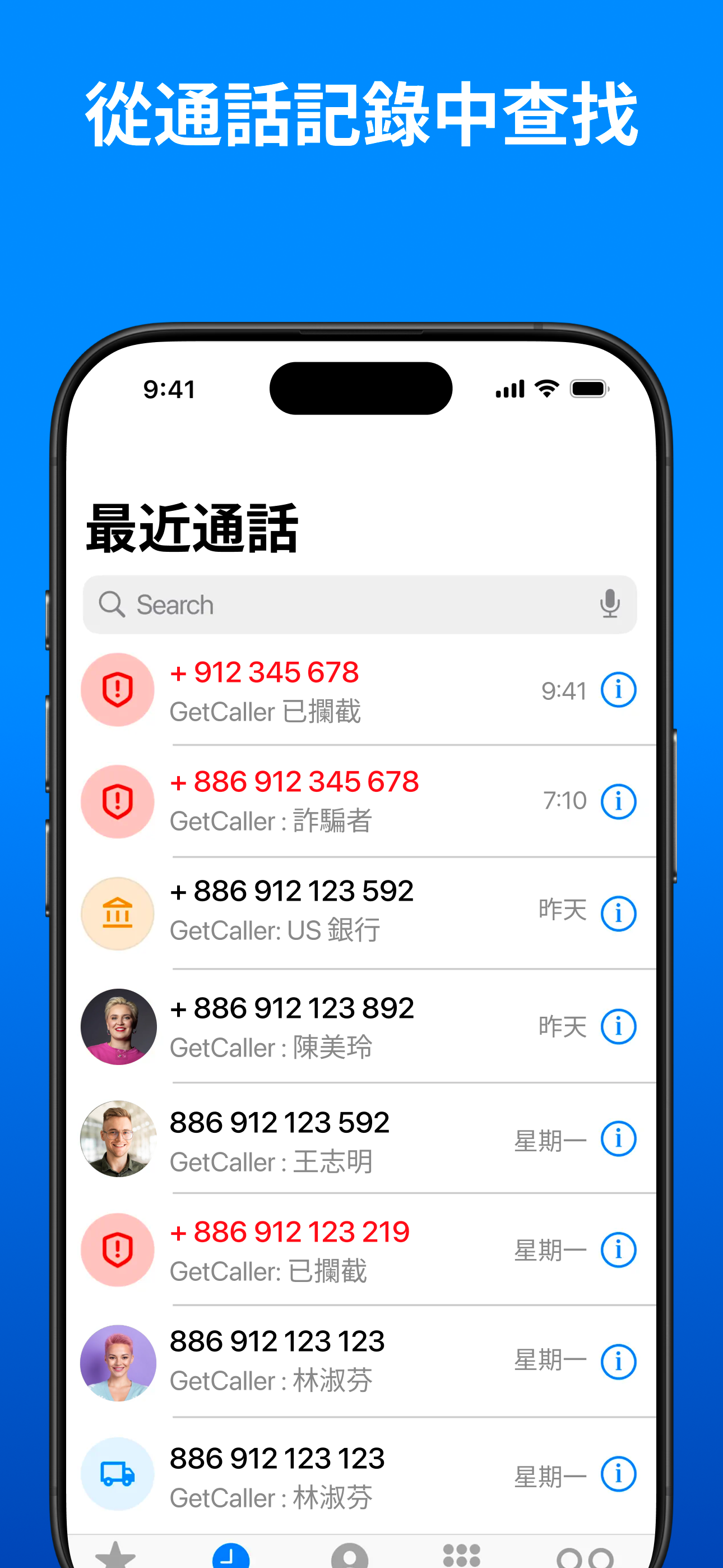
Full redesign across 15 Figma pages: onboarding, search & results, three-tab navigation, community tagging, contact details. Every screen in light and dark mode
ASO (120+ screenshots, 18+ languages).
Localized App Store screenshots targeting competitor keywords per market. Three angles: The Protector (spam), The Detective (search), The Experience (ad-free). Culturally adapted, not just translated.


04 — The Results
$7K
ARR when I joined (Aug 2025)
$115K+
ARR after 6 months (Feb 2026)
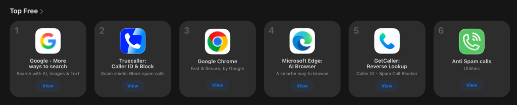
#5
Top Free in Kuwait App Store
5x
Weekly installs growth (ZA)
Week 4
LTV exceeds CPI
#5
Top Free in South Africa App Store
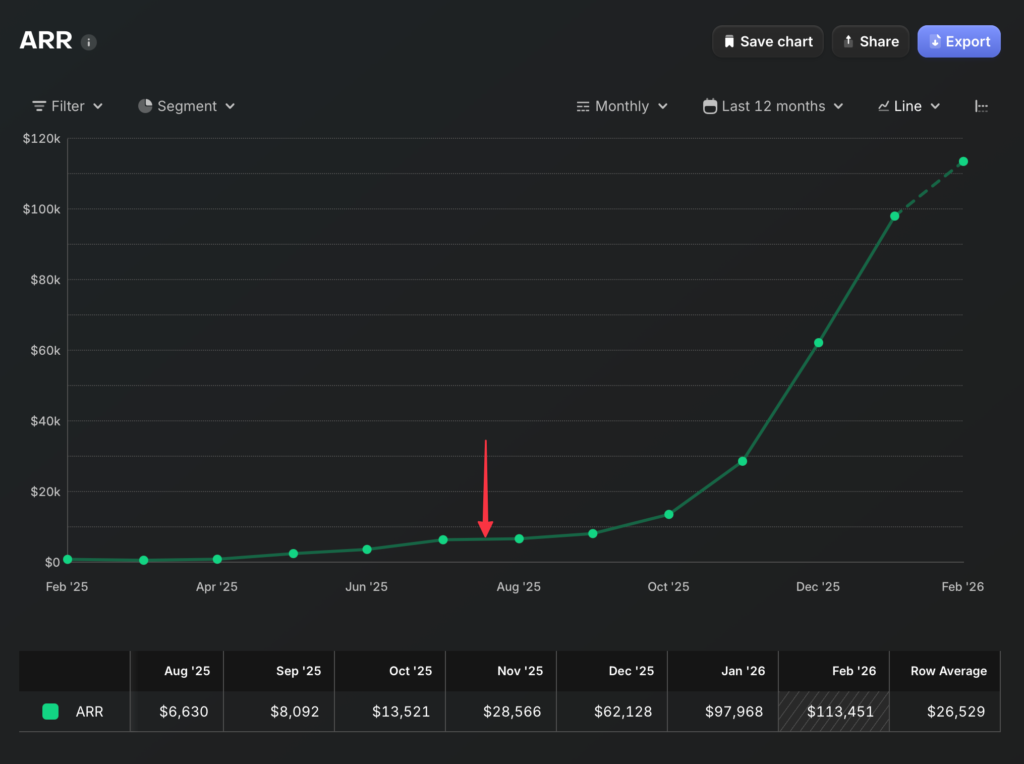
The inflection point came in late 2025 when A/B-tested premium flows and localized ASO hit production simultaneously. Revenue accelerated from ~$20K to $115K+ in 3 months.
South Africa cohort data confirmed sustainable growth: weekly installs grew from 497 to 1,868 (nearly 4x), and LTV exceeded CPI by Week 4 across all cohorts. Users weren’t just converting — they were staying subscribed.
The app reached #5 Top Free in Kuwait’s and South Africa App Store — direct result of Arabic RTL design and Gulf-targeted ASO.
The product went through two rebrands under my leadership: Truvio → GetCaller: Spam Block ID → GetCaller: Reverse Lookup. — I redesigned all affected assets and screenshot sets while maintaining ASO performance.
05 — Key takeaways
The inflection point came in late 2025 when A/B-tested premium flows and localized ASO hit production simultaneously. Revenue accelerated from ~$20K to $115K+ in 3 months.
Design leadership is product decisions, not just screens
The highest-impact thing I did was killing Android — a strategic call that freed resources for everything else.
Premium conversion is a UX problem
Same product, same price — $10K to $115K ARR. The difference was when and how users encountered the premium offer
A/B testing turns design into a growth engine
20+ variants tested systematically. The revenue chart shows compounding improvement, not a single launch spike.
Privacy is a design-worthy differentiator
“We don’t sell your data” only works if the UX is good enough that users don’t default to the data-selling alternative.